
It all starts with the sign
Through myths and legends, spoken languages contribute to history. Although there are no audio recordings of ancient times that can tell us how people lived or what they told one another, there is a level of certainty about visual variants of language. A fleeting visual version exists until this day: sign language. Contrary to popular belief, sign language is not universal. As with spoken languages, most countries have their own sign language, complete with dialects. But this is beyond the scope of this book. We are dealing with the recorded version of language, specifically the western forms of writing and their resulting typography. This typography could only develop after a long history that eventually resulted in the Latin alphabet. The journey to those twentysix letters, ten numbers and some added punctuation marks took more than 50,000 years. It all started with the sign.
Back to top
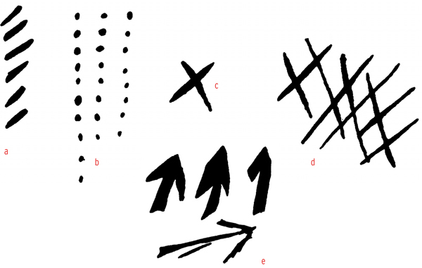
(a) glyphs or grooves and (b) dots that perhaps denote enumeration units; (c) and (d) crossed lines, perhaps indications of places; (e) arrows or spearpoints.
Pictographic writing system
The next step after depicting an object was the expansion of its meaning. A drawing of a sun, for instance, was used to depict the notion of warmth or day; the image of mountains was used to describe over the mountains, or foreign. By grouping such symbols together, legible connections were formed.
Back to top
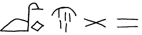
Ideograms from left to right: a bird plus an egg: the notion of fertility; vertical stripes from an arc in the sky: night; crossed lines: enmity, and parallel lines: friendship.
The transition
In the evolution from the pictographic system of writing to word image, Egyptian hieroglyphics are in a league of their own. There was also a more practical, shorthand version. This was the cursive hieratic that was used for religious texts on papyrus. Later, the more popular, widespread Demotic script developed, shown here in the middle section of the Rosetta Stone.
Back to top
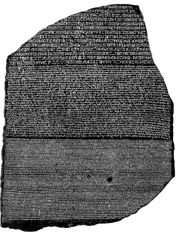
The stone illustrated on the facing page was found in Rosetta (Rashid). It contains the same text thrice: once in hieroglyphs, once in Demotic and once in Greek. By comparing these texts on this Rosetta Stone, Jean-François Champollion deciphered the Egyptian forms of writing. Reproduction from: Wallis Budge, Books on Egypt and Chaldaea Volume XVII, The Rosetta Stone, London 1904.
The cradle
The Middle East of about three thousand years ago is the cradle of most contemporary forms of writing. As well as Egyptian hieroglyphics based on ideograms the Sumerian Cuneiform script and the early Semitic alphabetic script developed there. The Phoenicians, a seafaring and trading nation, are accredited with inventing the first alphabet, around 1250 BC. It consisted of 22 consonants and was written from right to left. It was a so-called consonantal alphabet, or abjad. This means that in reading, a suitable vowel needed to be added to each consonant. With their merchant mentality, the Phoenicians spread the alphabet to Greece and the rest of the Mediterranean world. In the homeland, the Phoenician language evolved into by Aramaic around the year 1 AD. Aramaic was influenced by Phoenician and had the 22 consonants in common.
Back to top
All roads lead to Rome
After Phoenician and Aramaic, the written language of the Greeks took up the ascendancy in the mediterranian world. Our word alphabet was formed from the Greek letters alpha (a) and beta (b), meaning ox and house. Around 800 BC, they were using the Phoenician consonantal alphabet plus the Aramaic vowels A (alpha), E (epsilon), O (omicron), Y (upsilon). The I (iota) was a Greek invention. They also started writing from left to right. Slowly but surely, this alphabet became the alphabet of the western world. First through the Etruscans, who ruled over what is now Tuscany, and after them through the Latins who conquered the Etruscans.
Back to top
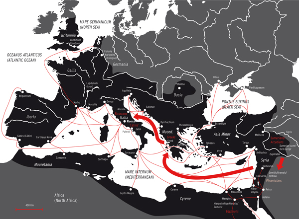
This map depicting Roman times (100 AD) shows the trade routes over water, from which we can deduce how writing systems spread. Of course trade routes over land existed as well, but the spread of writing systems happened much faster over water. The black area indicates the former Roman Empire. So it all started with the Sumerians in the land between the Tigris and Euphrates and it ended with the Latins. Our alphabet is still called the Latin alphabet. Illustration: Joep Pohlen
In the heyday of the Roman Empire, around the start of our western calendar era, the alphabet had matured into an extremely harmonious form. The peak of design technique in this development is the Roman capital, the Capitalis Romana or the Capitalis Monumentalis, the grandfather of all western capital or majuscule scripts. The Capitalis Monumentalis was the letter used for recording the empires glory in stone for eternity. A perfect example of this is Trajans Column in Rome.
Back to top
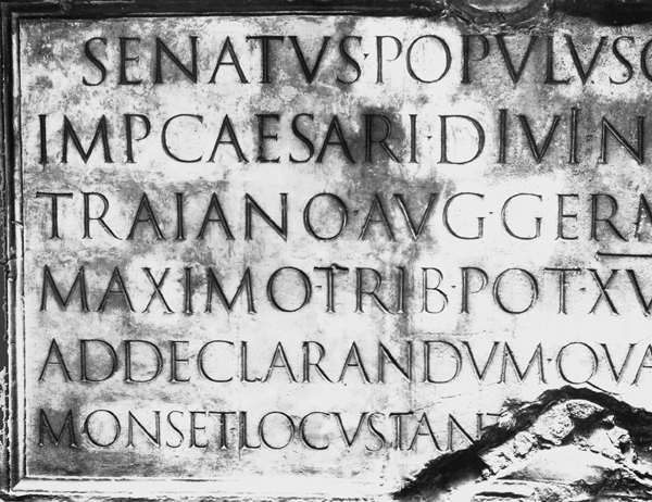
Text on Trajans Column in Rome (detail), 113 AD. The highest line is placed about two metres above eye height and the height of the letters decreases from top to bottom. The letters on the top line are 11 centimetres high, the ones at the bottom only 9 centimetres.
Filosofia Unicase. Designer Zuzana Licko added a modern uncial to her 1996 type face Filosofia. The Unicase above is a mixture of capitals (majuscules) and lowercase letters (minuscules). Anuncial is mainly written between two lines, while the longer descenders and ascenders distinguish the half uncial. The Filosofia Unicase plays with that by letting the j and the q just escape the confines of the two lines. The overall impression is still that of an uncial. The de sign is an interpretation of typefaces as shown in the Manuale Tipografico by Giambattista Bodoni, published as a type specimen book by his widow in 1818.
The Carolingian minuscule
In the fourth century, at the same time that the Roman Empire was in decline, Christianity was proclaimed the state religion by emperor Constantine the Great. In Western Europe, the church became an important producer of texts, which were still drawn up in Latin. These needed to be distributed, which could only happen after they had been copied by hand. Writing was and remained the monopoly of monks for a good thousand years. They perfected the art of producing and adorning manuscripts. Few people knew how to read or write. Even Charlemagne, who as emperor of the Holy Roman Empire was the most powerful man around 800 AD, was illiterate. He did not want to learn how to write himself he had other people to do that for him but to streamline the communication and administration of his vast empire and thus continue his vision and power, he decided in 768 to prescribe a new, official half uncial, composed by his secretary Alcuinus. As an abundance of often inaccurately copied texts were in circulation, Charlemagne had brand new, accurate copies made of the most authentic sources. These were marked ex authentico libro (from the original work) and were written in the official handwriting, the Carolingian minuscule. Partly for its clarity and beauty it became the dominant letter in Western Europe until the end of the thirteenth century.
Back to top
Carolingian minuscule: The longer descenders and ascenders are clearly visible.
That economic Gothic minuscule
Copying manuscripts, a backbreaking and eye-destroying task that was performed, day in, day out, by monks in scriptoria, did not only ask a lot from body and spirit, but also required a lot of expensive parchment, made from treated animal skins. Writers quickly learnt how to be more economical with the material by writing the letters smaller. At the same time, writing speeds were increased by adopting a more angular writing style. This is how the Gothic minuscule developed. After a short period of about two centuries in which the Gothic minuscule blossomed, hordes of other gothic hands followed. The most important of the gothic hands was the Textura (or Textualis) so called because of its likeness to fabric that surfaced around 1250. Other varieties appeared later, such as the Rotunda or Gothic round script and about a century later, the Schwabacher and the Fraktur. The movable type that Gutenberg used in 1455 for his Bible printing was a Textura type.
Back to top
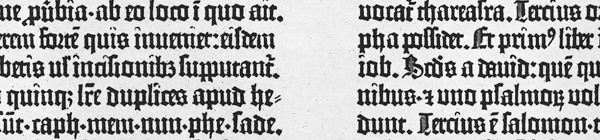
Detail Gutenberg 42-line Bible. For the western world, Gutenberg was the inventor of printing with movable metal type. Printing had been done before, but with complete pages cut on woodblocks. For the design of his type Gutenberg used the manuscript hand that was common at the time, a Gothic hand of the Textura family.
The big turning point
While the Gothic letter was at its peak in fourteenth and fifteenth century northwestern Europe, the Renaissance period erupted in Italy. In Italy, the Gothic forms never really took hold, not even in the typefaces, although the first printers who worked with movable type came from Germany. The rigid Gothic letter was seen as inelegant. The North Italians went back to the clarity of the Carolingian minuscule that in their minds was an older, more authentic and practical script, in closer proximity to the classical writers; they expanded the script with rounder and more graceful shapes. Classical texts were reborn in a form that in itself was a renaissance of the Carolingian minuscule: the Humanist minuscule.
Back to top
For conveniences sake, we let the history of western typography start with the Gutenberg Bible of 1455. This Bible was the first monumental European book to be printed with individual metal letters. The letters were based on Gothic manuscript scripts, so it is no surprise that the first letter to be cut was the Textura with all the ligatures and abbreviations as featured in the manuscripts. Before the invention of movable type, books and texts were reproduced by copying them in scriptoria or by carving the mirror image of a complete, handwritten page in a wood block and printing from it. After the invention of movable type, printing and typefounding techniques did not fundamentally change for about four centuries. The most important technical developments to increase working speeds took place over the last hundred years, roughly from about 1880.
Back to top
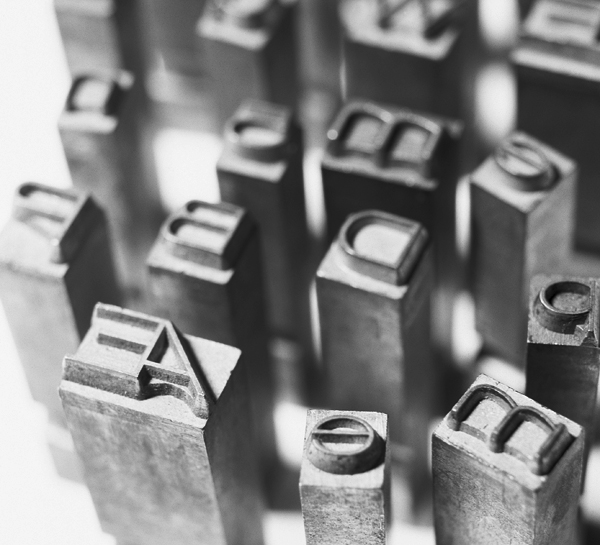
For five hundred years, lead typesetting remained the norm. The alloy for manual type casting is harder than that of type casting machines like the Monotype. A hot-metal typecasting machines metal only needs to last one impression before being melted down and recycled. Foundry-cast 'cold metal', on the other hand, needs to last a lot longer.
Mechanical composition
The first important development was the introduction of the Benton Pantograph in 1885 by the American Linn Boyd Benton. The machine allowed the mechanical cutting of a metal letter in any desired size. A point followed along the contours of the drawn letter. Engraving a mould for a 4 pt letter (or even smaller) by hand had soon become a thing of the past.
Back to top
Photographic composition
The second important step was the introduction of photographic typesetting in the late fifties of the twentieth century. Metal was replaced by photographic film and photographic paper. This was a cheaper and less unhealthy way of working that allowed for free spacing and even overlapping of faces, that made continuous enlarging and reducing possible and, to the sorrow of purists, the photographic distortion of the letter.
Back to top
Digital composition
A third important development started in 1965, when the German company Hell introduced digital typesetting using the cathode ray tube. Other established providers had to follow suit and they, too, introduced digital typesetting. An important consequence of this development was the introduction of the fairly affordable and user-friendly Apple Macintosh in 1984 a machine that was, all on its own, responsible for the second wave of democratisation. The graphic designer him or herself could now set texts and edit them with digital typefaces in PostScript format, after which the texts were exposed to photographic film or photo paper with the appropriate laser exposure unit. This made professional typesetters a lot less influential. Their responsibility for the camera-ready copy transferred to the designer.
Back to top
======================================================================================
Leaf through Letter Fountain
Back to top
(a) glyphs or grooves and (b) dots that perhaps denote enumeration units; (c) and (d) crossed lines, perhaps indications of places; (e) arrows or spearpoints.
Pictographic writing system
The next step after depicting an object was the expansion of its meaning. A drawing of a sun, for instance, was used to depict the notion of warmth or day; the image of mountains was used to describe over the mountains, or foreign. By grouping such symbols together, legible connections were formed.
Back to top
Ideograms from left to right: a bird plus an egg: the notion of fertility; vertical stripes from an arc in the sky: night; crossed lines: enmity, and parallel lines: friendship.
The transition
In the evolution from the pictographic system of writing to word image, Egyptian hieroglyphics are in a league of their own. There was also a more practical, shorthand version. This was the cursive hieratic that was used for religious texts on papyrus. Later, the more popular, widespread Demotic script developed, shown here in the middle section of the Rosetta Stone.
Back to top
The stone illustrated on the facing page was found in Rosetta (Rashid). It contains the same text thrice: once in hieroglyphs, once in Demotic and once in Greek. By comparing these texts on this Rosetta Stone, Jean-François Champollion deciphered the Egyptian forms of writing. Reproduction from: Wallis Budge, Books on Egypt and Chaldaea Volume XVII, The Rosetta Stone, London 1904.
The cradle
The Middle East of about three thousand years ago is the cradle of most contemporary forms of writing. As well as Egyptian hieroglyphics based on ideograms the Sumerian Cuneiform script and the early Semitic alphabetic script developed there. The Phoenicians, a seafaring and trading nation, are accredited with inventing the first alphabet, around 1250 BC. It consisted of 22 consonants and was written from right to left. It was a so-called consonantal alphabet, or abjad. This means that in reading, a suitable vowel needed to be added to each consonant. With their merchant mentality, the Phoenicians spread the alphabet to Greece and the rest of the Mediterranean world. In the homeland, the Phoenician language evolved into by Aramaic around the year 1 AD. Aramaic was influenced by Phoenician and had the 22 consonants in common.
Back to top
All roads lead to Rome
After Phoenician and Aramaic, the written language of the Greeks took up the ascendancy in the mediterranian world. Our word alphabet was formed from the Greek letters alpha (a) and beta (b), meaning ox and house. Around 800 BC, they were using the Phoenician consonantal alphabet plus the Aramaic vowels A (alpha), E (epsilon), O (omicron), Y (upsilon). The I (iota) was a Greek invention. They also started writing from left to right. Slowly but surely, this alphabet became the alphabet of the western world. First through the Etruscans, who ruled over what is now Tuscany, and after them through the Latins who conquered the Etruscans.
Back to top
This map depicting Roman times (100 AD) shows the trade routes over water, from which we can deduce how writing systems spread. Of course trade routes over land existed as well, but the spread of writing systems happened much faster over water. The black area indicates the former Roman Empire. So it all started with the Sumerians in the land between the Tigris and Euphrates and it ended with the Latins. Our alphabet is still called the Latin alphabet. Illustration: Joep Pohlen
The Roman and Holy Roman Empires
In the heyday of the Roman Empire, around the start of our western calendar era, the alphabet had matured into an extremely harmonious form. The peak of design technique in this development is the Roman capital, the Capitalis Romana or the Capitalis Monumentalis, the grandfather of all western capital or majuscule scripts. The Capitalis Monumentalis was the letter used for recording the empires glory in stone for eternity. A perfect example of this is Trajans Column in Rome.
Back to top
Text on Trajans Column in Rome (detail), 113 AD. The highest line is placed about two metres above eye height and the height of the letters decreases from top to bottom. The letters on the top line are 11 centimetres high, the ones at the bottom only 9 centimetres.
Filosofia Unicase. Designer Zuzana Licko added a modern uncial to her 1996 type face Filosofia. The Unicase above is a mixture of capitals (majuscules) and lowercase letters (minuscules). Anuncial is mainly written between two lines, while the longer descenders and ascenders distinguish the half uncial. The Filosofia Unicase plays with that by letting the j and the q just escape the confines of the two lines. The overall impression is still that of an uncial. The de sign is an interpretation of typefaces as shown in the Manuale Tipografico by Giambattista Bodoni, published as a type specimen book by his widow in 1818.
The Carolingian minuscule
In the fourth century, at the same time that the Roman Empire was in decline, Christianity was proclaimed the state religion by emperor Constantine the Great. In Western Europe, the church became an important producer of texts, which were still drawn up in Latin. These needed to be distributed, which could only happen after they had been copied by hand. Writing was and remained the monopoly of monks for a good thousand years. They perfected the art of producing and adorning manuscripts. Few people knew how to read or write. Even Charlemagne, who as emperor of the Holy Roman Empire was the most powerful man around 800 AD, was illiterate. He did not want to learn how to write himself he had other people to do that for him but to streamline the communication and administration of his vast empire and thus continue his vision and power, he decided in 768 to prescribe a new, official half uncial, composed by his secretary Alcuinus. As an abundance of often inaccurately copied texts were in circulation, Charlemagne had brand new, accurate copies made of the most authentic sources. These were marked ex authentico libro (from the original work) and were written in the official handwriting, the Carolingian minuscule. Partly for its clarity and beauty it became the dominant letter in Western Europe until the end of the thirteenth century.
Back to top
Carolingian minuscule: The longer descenders and ascenders are clearly visible.
That economic Gothic minuscule
Copying manuscripts, a backbreaking and eye-destroying task that was performed, day in, day out, by monks in scriptoria, did not only ask a lot from body and spirit, but also required a lot of expensive parchment, made from treated animal skins. Writers quickly learnt how to be more economical with the material by writing the letters smaller. At the same time, writing speeds were increased by adopting a more angular writing style. This is how the Gothic minuscule developed. After a short period of about two centuries in which the Gothic minuscule blossomed, hordes of other gothic hands followed. The most important of the gothic hands was the Textura (or Textualis) so called because of its likeness to fabric that surfaced around 1250. Other varieties appeared later, such as the Rotunda or Gothic round script and about a century later, the Schwabacher and the Fraktur. The movable type that Gutenberg used in 1455 for his Bible printing was a Textura type.
Back to top
Detail Gutenberg 42-line Bible. For the western world, Gutenberg was the inventor of printing with movable metal type. Printing had been done before, but with complete pages cut on woodblocks. For the design of his type Gutenberg used the manuscript hand that was common at the time, a Gothic hand of the Textura family.
The big turning point
While the Gothic letter was at its peak in fourteenth and fifteenth century northwestern Europe, the Renaissance period erupted in Italy. In Italy, the Gothic forms never really took hold, not even in the typefaces, although the first printers who worked with movable type came from Germany. The rigid Gothic letter was seen as inelegant. The North Italians went back to the clarity of the Carolingian minuscule that in their minds was an older, more authentic and practical script, in closer proximity to the classical writers; they expanded the script with rounder and more graceful shapes. Classical texts were reborn in a form that in itself was a renaissance of the Carolingian minuscule: the Humanist minuscule.
Back to top
The typographical era
For conveniences sake, we let the history of western typography start with the Gutenberg Bible of 1455. This Bible was the first monumental European book to be printed with individual metal letters. The letters were based on Gothic manuscript scripts, so it is no surprise that the first letter to be cut was the Textura with all the ligatures and abbreviations as featured in the manuscripts. Before the invention of movable type, books and texts were reproduced by copying them in scriptoria or by carving the mirror image of a complete, handwritten page in a wood block and printing from it. After the invention of movable type, printing and typefounding techniques did not fundamentally change for about four centuries. The most important technical developments to increase working speeds took place over the last hundred years, roughly from about 1880.
Back to top
For five hundred years, lead typesetting remained the norm. The alloy for manual type casting is harder than that of type casting machines like the Monotype. A hot-metal typecasting machines metal only needs to last one impression before being melted down and recycled. Foundry-cast 'cold metal', on the other hand, needs to last a lot longer.
Mechanical composition
The first important development was the introduction of the Benton Pantograph in 1885 by the American Linn Boyd Benton. The machine allowed the mechanical cutting of a metal letter in any desired size. A point followed along the contours of the drawn letter. Engraving a mould for a 4 pt letter (or even smaller) by hand had soon become a thing of the past.
Back to top
Photographic composition
The second important step was the introduction of photographic typesetting in the late fifties of the twentieth century. Metal was replaced by photographic film and photographic paper. This was a cheaper and less unhealthy way of working that allowed for free spacing and even overlapping of faces, that made continuous enlarging and reducing possible and, to the sorrow of purists, the photographic distortion of the letter.
Back to top
Digital composition
A third important development started in 1965, when the German company Hell introduced digital typesetting using the cathode ray tube. Other established providers had to follow suit and they, too, introduced digital typesetting. An important consequence of this development was the introduction of the fairly affordable and user-friendly Apple Macintosh in 1984 a machine that was, all on its own, responsible for the second wave of democratisation. The graphic designer him or herself could now set texts and edit them with digital typefaces in PostScript format, after which the texts were exposed to photographic film or photo paper with the appropriate laser exposure unit. This made professional typesetters a lot less influential. Their responsibility for the camera-ready copy transferred to the designer.
Back to top
======================================================================================
Leaf through Letter Fountain