
A closer look at the type family
Over the course of time, different terms for the appearances and parts of typefaces have been invented in various countries and languages. And now, in the computer era, with its growing prevalence of English terms, there is complete confusion. Is it cursive, oblique or italic? Regular, normal or roman? Consensus on this front would be a good thing, but cannot be expected just yet. To at least provide clarity for the terms used by us in this book, we will here give their definitions.
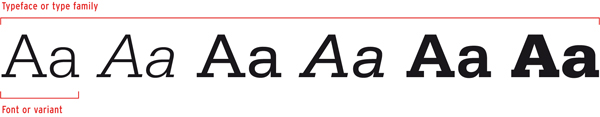
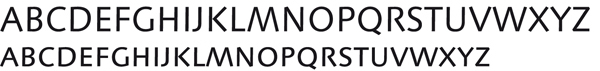
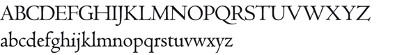
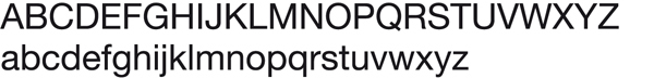
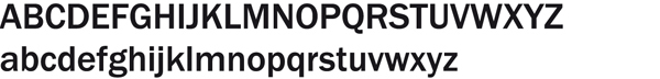
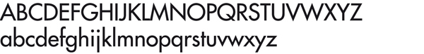
A typeface category is a named group of typefaces displaying similarities, for example script types. A typeface or type family is a group of types closely related in design, designed to be used together and usually bearing the same name (with various modifiers), such as Rockwell or Helvetica. A font is a variant of a typeface, which can mean a different weight (bold or light), a different width (condensed or extended), a different angle (slanted or oblique), or even a different form (cursive or italic), or any of these parameters in combination, such as Helvetica 23 Ultra Light Extended Oblique. The standard, normal or regular version of a typeface is often called the roman. So a typeface may include various fonts. This means that if we buy a font for our computer, we only buy one version of a typeface. Mostly, however, a number of fonts such as Regular, Italic, Bold, and Bold Italic are sold as a set.
Back to top
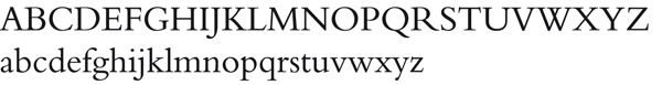
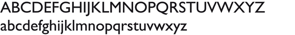
The Linotype typeface Serifa displayed in all available variants.
The 26 letters of the alphabet are only the core characters in a font. Without numerals, punctuation marks, special characters and accented signs, a font is not complete. And each language has its specific punctuation marks and ligatures, which were added to some fonts by the type designer.
UPPERCASE and lowercase letters
In handwriting and manuscripts, these letters are also known as capitals or majuscules and small letters or minuscules. The term capital letter derives from Roman inscriptional lettering cut in stone, to which the letters often owe their straight and incised features. Lowercase letters were only later added to handwriting.
Back to top
The Trajan typeface, designed by Carol Twombly for Adobe, is based on the Roman inscriptions on Trajans Column in Rome (dedicated in 113 AD).
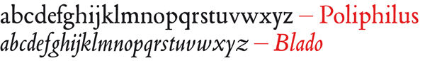
The Blado typeface was revived by Stanley Morison in 1923 after a 1526 italic by Ludovico Degli Arrighi. Although it was an independent typeface, it was also intended for use as a companion italic for the Poliphilus roman (above), which Morison also revived for Monotype. The Arrighi italics are seen as the first cursive typefaces for use in printed matter.
The variants
Although it seems that the italic version of a typeface was there from the beginning, this is definitely not the case. The italic only came into being around 1500, and is derived from the Italian humanistic handwriting and chancery hands of the time. The italic was initially used as a text letter, designed from the economic cursive script.
Back to top
Stempel Garamond Roman shows that it is based on the roman, cut by Claude Garamond in the book Hypnerotomachia Poliphili (Jacques Kerver edition, 1546). Claude Garamond, for his part, had been inspired by the roman that Francesco Griffo cut about fifty years previously for the printer Aldus Manutius.
Small capitals
Small capitals are smaller versions of capital letters not reduced capitals, but especially designed small capitals, which can often be ordered with a certain type family as a so-called Expert or SC font. In height, these small capitals are slightly bigger than the x-height of lowercase letters, and they have a matching weight.
Back to top
Hans Eduard Meier's Syntax was first released by Linotype in 1968. It was the last sans-serif to be produced for both metal and phototypesetting. In the late 1990s the design was extensively revised, adding features such as the small capitals shown above/at left. Small capitals were first introduced c.1525. Five hundred years later, they are regarded as a related variant of a typeface, like the italic.
Ligatures, diphthongs and logotypes
Ligatures are combinations of characters that were designed because, in metal typesetting, the overhanging ascender in the letter f would crash into an ascender or the dot of an i if it directly followed the f. Logotypes are less clearly visible combinations of characters such as the ampersand or & symbol. This combination is also made up of ligatures. Typographic diphthongs or ligatured vowels are rarely used letter combinations. They mainly convey that a word has a special pronunciation. The French word il (eye) is such an example.
Back to top
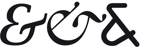
In the & symbol of the Demos Italic and the Galliard Italic, the separate letters (et) are still clearly visible. In the Alega on the far right, the designer has departed from a clear picture of the combination. Although this combination strictly speaking forms part of the logotypes, it is more correct to call the Demos and Galliard version a ligature.
Parts of a Monotype Bembo Semibold letter. In red: a ligature with the contours of the individual letters f and i superimposed.
Numerals
It is generally held that as soon as writing systems came into being, people felt a need to describe quantities. A few centuries BC, the numbers we still use to this day popped up in India. At the time, they were used as a notation system in Hindu algebra. It was a highly evolved system, which the Arabs adopted during trade missions and conquests. These numbers are usually called Arabic numerals. Even though we would not be able to go without the zero nowadays, the earliest Hindu system had no symbol for it.
Back to top
The figures from FF Profile below show oldstyle tabular figures (top row), lining tabular figures (second row) and oldstyle figures (OSF) (third row) shown in running text. These tabular figures all share a common width indicated by the vertical lines; the point is to make vertical alignment easy and consistent, and the foot serifs on the '1' have been added to counterbalance the greater white space surrounding the figure. Conversely, the third example shows proportional (non-tabular) figures, where the widths are dictated by the character shapes themselves, and no extra foot serifs are required. FF Profile also has specially drawn (and not just reduced!) numerals for fractions, superior and inferior numerals (shown at bottom).
Punctuation marks
A font usually contains a large number of punctuation marks, some of which can have very divergent forms like the single quotation mark, pictured below in different typefaces. Punctuation marks, just like the Roman numerals, were used in our writing system before the Arabic numerals. Commas, full stops, paragraph marks and hyphens were already used in handwritten books to support readability.
Back to top
Quotation marks are very different in different typefaces and follow the design of the characters from the typeface. The examples are from different typefaces but have the same size in points.
The biggest stumbling block is, surely, the quotation mark. There are single and double quotation marks sometimes called six-nine because of their shape and order but also « guillemets », of French origin, which in Germany are used »the other way around«. For a quotation within a quotation, a different solution needs to be found, and the most elegant one in this case is using the double quotation marks, the sixty-six/ninety-nine, as the second set. So: a quotation within a quotation.
The single quotation mark, particularly the nine, has yet another function. In a word like doesnt or cats, it is called an apostrophe.
The full stop, in America called a period, is the punctuation mark that is used the most. A full stop ends a sentence or an abbreviation. Internationally recognised abbreviations or symbols of, for example, monetary units, measurements, weights and physical and chemical indicators are written without a full stop. A few of these abbreviations are: cm (centimetre), km (kilometre), °C (degree Celsius) and kg (kilogram). Another case is the abbreviations of names like BA, AA and BBC; these are usually capitalised and do not have full stops. When abbreviating days and months, no full stop is used. The first letter is, however, capitalised. For days: Sun, Mon, Tue, Wed, Thu, Fri, Sat and Sun. For months: Jan, Feb, Mar, Apr, May, Jun, Jul, Aug, Sep, Oct, Nov and Dec.
A full stop is usually not used after abbreviations of names.
The full stop is also used in number sequences. In English-speaking countries, a full stop is used as a decimal point while the comma or, recently, a space is used to present large numbers in a more readable form. So, for instance: 14,300.90 and 22,356 or 22 356.
After the full stop, the comma is the most important punctuation mark. This is one of the most difficult punctuation marks to use because the right placement has a lot to do with a good sense of language. Therefore the author has primary responsibility. Comma usage increases readability, but practice shows that a comma is used too much, rather than too little.
It is difficult to know when a semicolon should be used. Often, a full stop or comma is used instead, even when a semicolon would be the better choice. The semicolon serves two purposes. Firstly, it is used to indicate the connection between two independent finite clauses. Secondly, it is used in lists that have internal punctuation.
The colon is easier to use. It is used to indicate that an explanation, description, elucidation or conclusion follows, and prior to a list. In general, the text after the colon starts with a lowercase letter, except when it is a quote or proper name.
The question mark is usually placed at the end of a sentence, with no space between the last word and the question mark. It replaces the full stop.
The exclamation mark is used in two ways: after an exclamation and for emphasis. It is placed, with no space, at the end of a sentence, replacing the full stop.
Brackets or parentheses are used to clarify, elucidate or add, or to refer. For instance: Reuters (London) is recruiting intern(s) (m/f) online (www.uk.reuters.com). Besides parentheses, there are square brackets. These are generally used to indicate [...] that part of a quote is omitted, or they are used insert an explanation that did not feature in the original text.
The oblique stroke or slash has seen a real revival since the advent of the internet. Although a slash online indicates a referral to a page deeper down in the hierarchy of a site, it has the following functions for running texts: to indicate a choice (m/f), in abbreviations (w/o) or as a linebreak when quoting from plays, poetry, etc. It is also used to replace the dash or hyphen when connecting words or sentences. The mirrored version of the slash, the backslash (\), is a symbol that was first added to an ASCII keyboard in 1961, to be used with the IBM 7030 supercomputer. The slightly more slanted version of the slash is the fraction (/). It is used for, indeed, fractions: ¼, 2/16. The vertical bar (|) nearly never occurs in normal texts but is sometimes used as a typographic styling element by designers.
And then there are the hyphens and dashes. They come in a variety of sizes. Hyphens are, first off, used as a symbol to break words. The second use of a hyphen is as a trait dunion. A hyphen is added when two consonants or vowels are pronounced separately rather than as a diphthong, for instance in bowl-like or anti-intellectual. It is also inserted when there is a chance of misreading, as for instance with co-worker (people might think a cow had an orker). Hyphens are also used to form compounds and to connect numbers and words in adjectival phrases. Finally, hyphenation is sometimes used for dates (9-8-1956), although slashes or full stops are more frequently used.

The en dash is longer than a hyphen and is used to demarcate a parenthetical thought or to indicate a sudden change of direction as in, for instance: Unfortunately the document to be discussed which you received via email is no longer up to date. Usually these dashes can be replaced by commas, or the phrase can be bracketed.
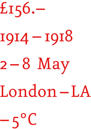
In the above, en dashes are used. When using a dash to replace the word to, a thin space is added before and after the dash. A space is added before the minus sign in case of degrees.
The em dash () is used to demarcate parenthetical thought in English texts, but the dashes are unspaced (without white spaces on either side).
The underscore (_) is a line that lies slightly below the baseline and has the same length as an en dash. (The underscore is often used in email addresses, computer filenames and website names)
Even though there are more punctuation marks to talk about, we have now discussed the ones that are most commonly used. It is advisable to look at these characters when choosing a typeface for a commission or a house style because they heavily feature in texts and so influence the styling.
Accents
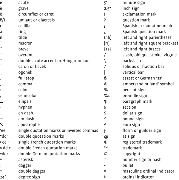
These are called diacritics and they indicate a different sound or stress when used with a letter. There is a difference between widely used accents and special accents, used in for instance Central-European languages which are not available readily or at all in some typefaces.
Back to top
Other commonly used characters
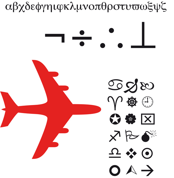
Special pi fonts are developed for letters and characters that are not included in a font though still often used. Examples are: the Zapf Dingbats, with all kinds of symbols, and Symbol, which includes a lot of characters for scientific applications. There are symbols and dingbats for virtually everything. The most frequently used ones are the Greek letters and the mathematic symbols in the Symbol. It is not surprising that they are the standard font, supplied with most computers. Below right is an example of the Wingdings typeface.
Back to top
In typography, several different measurement systems are used besides the metric system. On the European continent, the so-called Didot point system used to be a standard, derived from the metal type era. In Britain and America, however, the Anglo-American point system is used. The inch has always been used for typewriters and (dot matrix) printers. As a result of automation and the use of pin-feed paper, the inch was introduced in the graphic industry. So, a total of four linear measurement systems are used.
Back to top
Metric or decimal system
The main difference with other measurement systems is that it is a decimal system. At an international congress held in Paris in 1795, the metre was established as the forty-millionth part of the earths circumference (unfortunately we do not know who measured this). The French (platinum) standard metre gained international recognition in 1889, with the exception of Britain, the Commonwealth and the United States.
Back to top
Didot point system
The Parisian type founder Fournier established a point system which he based on his own non-standard foot. Fournier developed it into a duodecimal system. Later, Fourniers system was revised by the type founder Didot. The Fournier point was a bit smaller than the Didot point, which was based on the pied du roi, a linear measurement that was accepted in the whole of France. An augustin or cicero contains 12 Didot points.
Back to top
Pica system
The pica system is the Anglo-Saxon counterpart of the Didot point system. The pica is also a duodecimal system which is divided into 12 points. However, the pica is somewhat smaller than the Didot. As it lacks international calibration, there is a lot of confusion about the pica. Because many printers in the graphic industry are American, the pica has become the type measurement unit which is most applied. According to the United Bureau of Standards a pica measures 0.351461 mm. However, the measurement units indicated in points in Letter Fountain are expressed in pica points as used in computer software. There, an inch is divided into 72 pica points (making 1 point the equivalent of 0.352777 mm).
Back to top
Inch
An inch is the Anglo-Saxon measuring unit of the duodecimal system. The inch is defined as 25.4 millimetre.
Back to top
In 1997, the measuring set Mackie M was launched, a metal and larger version of the Letter Fountain ruler. Photo: Joep Pohlen.
Type body size
The type body size that we use to this day is a measuring unit that directly derives from metal type. To prevent the ascenders and descenders of successive lines from touching each other, letters were cast on a body slightly larger than the ascender-to-descender distance. The body size, in metal type, was indicated in points; in Anglo-Saxon countries using pica points; and on the European continent Didot points (with a cicero of 12 points). As type designers considered the space on the body to be the design area, characters with different image sizes occurred.
Back to top
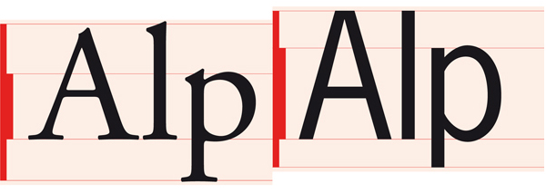
Adobe Garamond (below left) has a much smaller type image than the American sans-serif (or Benton-Linéale) News Gothic on the right. Both have a body size of 145 pt. The example also shows the typically larger x-height that is characteristic for many American designs. This makes it obvious that 9 pt Adobe Garamond looks a lot smaller than 9 pt News Gothic.
Line spacing
If, in metal type, more space between lines was called for, thin strips of lead of one or more point(s) in thickness were inserted in between the lines of metal type. This insertion of extra white space was called leading. The line spacing, however, is the measured distance between the baselines of consecutive lines.
Back to top
The various attempts that have been made to organise the multitude of typefaces into clear categories have produced some valuable type classifications, none of them completely satisfactory. There are some methods that follow a chronological order, some that place the emphasis on the differences in form and others that look at whether a type derives from a manuscript or not. Categorisations of types may furthermore fill a purely theoretical need or may have a pragmatic search function. In this chapter a variety of classifications and divisions are discussed.
Back to top
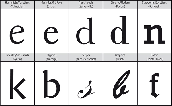
The most frequently used classification for the division of typefaces by the French Maximilien Vox in 1954 had six categories. Below the extended ATypI version of 1962 with ten categories.
For Letter Fountain we are using one widely accepted classification: that of the Frenchman Maximilien Vox from 1954. This classification is based on form differences, but also works chronologically. In 1962, the classification was accepted as a standard by the Association Typographique Internationale (ATypI). In Germany, it was set down as DIN 16518 (1964) and in the UK as British Standard 2961 (1967).
As a large number of typefaces are ignored in this classification, we have amended and extended it at various points to do justice to typefaces that were designed after 1954, particularly the great many sans-serif typefaces that have been added. This is why we have divided the sans-serifs into four groups, so as to restore the balance between the seriffed types and sans-serifs for our time.
Vox+
On the following pages, an amended version of the Vox classification is discussed in detail. As names can differ in various countries, we have also added the French and German versions. As mentioned before, we have made some additions to the original classification as designed by Maximilien Vox. This is why we call it Vox+.
Back to top
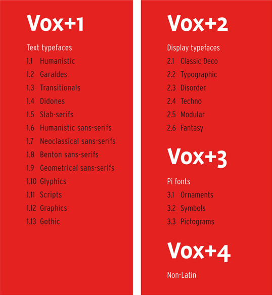
Vox+1
Since the beginning of the computer era, the use of sans-serif typefaces has greatly increased. We therefore thought it necessary to reserve more space in the division for these sans-serifs. Form differences play an even greater part in Vox+ than in the original version. This is why the chronology somewhat takes a back seat.
Back to top
1.1 Humanistic [FR: Humanes, GE: Venezianische Antiqua]
The oldest Italian, mostly Venetian, printing type, designed at the end of the fifteenth century during the Italian Renaissance, are based on the handwriting of the humanists. This script went back to the Carolingian minuscule of the ninth century. In 1470, Nicolas Jenson, a French printer who worked in Venice, was one of the first to cut a refined humanistic typeface. This is generally seen as the prime example for the first group of types we use to this day: the humanists.
Omnibus Jenson Classico. This typeface was designed by Franko Luin after the original by Nicolas Jenson of the fifteenth century, and is distributed by Linotype Library.
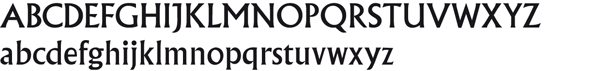
1.2 Garaldes [FR: Garaldes, GE: Französische Renaissance-Antiqua]
Appeared during the French Renaissance period. The name garaldes is a contraction of the names of the French punchcutter Claude Garamond and of the Venetian printer Aldus Manutius. The first garaldes were based on the humanists, but they are more sophisticated, have narrower proportions and more fluent transitions.
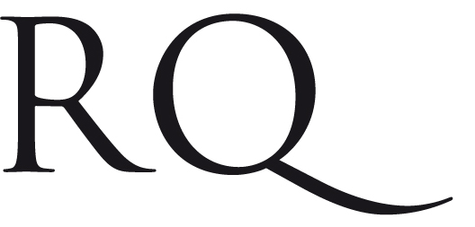
Monotype Bembo. Stanley Morison designed this letter after the typeface that was first used in Cardinal Pietro Bembos De Aetna of 1495. Pay attention to Bembos characteristic capital letter R.
1.3 Transitionals [FR: Réales, GE: Barock-Antiqua]
The transitionals are the early neoclassical typefaces that appeared in the middle of the eighteenth century and were usually designed for a specific purpose. They are seen as the first types that were really designed. The transitionals mark the transition between the Renaissance and neoclassicism.
Monotype Baskerville. John Baskerville designed this typeface in 1757. Although his books were not a very big commercial success in England, his Baskerville was admired and much imitated.
1.4 Didones [FR: Didones, GE: Klassizistische Antiqua]
These are the late neoclassical seriffed types and their name is a combination of the French printing family Didot and the Italian printer Bodoni of Parma. The typeface Bodoni by Giambattista Bodoni, also known as the king of the typographers (principe dei tipografi) or printer to the kings, is seen as the highlight of the didones.
Bauer Bodoni and Omnibus Bodoni Classico. Bauer Bodoni (above) by Heinrich Jost is generally seen as one of the most beautiful revivals of the original Bodoni of the Manuale Tipografico. Bodoni Classico shows the version by Franko Luin with the slightly thickened serifs and horizontal parts for smaller texts.
1.5 Slab-serifs [FR: Mécanes, GE: Serifenbetonte Linear-Antiqua]
The slab-serifs are constructed typefaces and in general have hardly any thick-thin contrast. Some early slab-serifs are called egyptians allegedly after the popularity of the Napoleonic campaign in Egypt and the resulting interest in Egyptology. (Confusingly, many of the geometrically constructed slab-serifs designed a hundred years later all bear egyptian place names such as Karnak, Luxor, Memphis etc., but they have nothing to do with the shape of the earlier egyptians which used the Grotesque form as their basis.) The Clarendon typeface is so typical for this group that in some English classifications the term slab-serif is replaced with Clarendon.
Clarendon Light (b). A 1953 design by Hermann Eidenbenz for Haas, derived from an 1845 version by Robert Besley. The version above is by Bitstream.
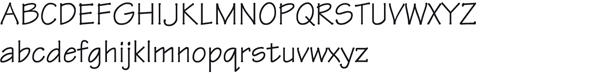
1.6 Humanistic sans-serifs [FR: Linéales Humanes, GE: Serifenlose humanistische Linear-Antiqua]
Sans-serifs are typefaces that owe their essential form to writing. The French word linéal unsurprisingly means advancing in a straight line. They first appeared at the beginning of the nineteenth century (Caslon Foundry, 1812/14), but only in capitals. The first sans-serif with lowercase appeared in England in 1834. Towards the end of the nineteenth century, every self-respecting foundry had a number of sans-serif typefaces with several variants. The humanistic sans-serifs are different because they follow the proportions of the classical Roman capital for the capitals and the humanistic manuscript hand for lowercase letters.
Gill Sans, a 1928 design by Eric Gill for Monotype.
1.7 Neoclassical sans-serifs [FR: Linéales Classicistes, GE: Serifenlose klassizistische Linear-Antiqua]
The sans-serif neo-grotesques appeared as a result of the popularity of the Swiss style of typography after the Second World War. Sans-serif started to get used more and more frequently with the advent of the Helvetica in 1957, created by the Swiss Max Miedinger.
Neue Helvetica, a reworking of a 1957 design by Max Miedinger for Haassche Schriftgießerei.
1.8 Benton sans-serifs [FR: Benton-Linéales, GE: Serifenlose Benton-Linear-Antiqua]
These lineales are also called American gothics. The prototype of this group is Franklin Gothic by Morris Fuller Benton. These typefaces show a close relationship to the neoclassical sans-serifs.
Franklin Gothic Book, a design (1903-1912) by Morris Fuller Benton for American Type Founders.
1.9 Geometric sans-serifs [FR: Linéales Géométriques, GE: Geometrische serifenlose Linear-Antiqua]
The geometric sans-serifs seem to be drawn with ruler and compass. It takes a lot of skill to produce clearly legible typography with these typefaces. Good microtypography, such as choosing the right letter spacing and line interval, is very important.
Futura, a 1927 design by Paul Renner for Bauersche Gießerei.
1.10 Glyphics [FR: Incises, GE: Antiqua-Varianten]
The glyphics show a relationship with stone-cut or metal-cut letters. In Latin they are called litterae incisae and in French, lettres incisées. They are usually monumental, or, in other words, powerful, firm and simple, adapted to the restrictions of the material from which they are cut.
Monotype Albertus. From 1932 to 1940, Berthold Wolpe designed this typeface for Monotype. The forms clearly show that he based his design on letters that were cut in bronze, a technique in which the material is removed from around the letter. The form, in other words, came about from the outside of the letter and not, as is the case for most type designs, from the shape of the letter itself.
1.11 Scripts [Fr: Scriptes, D: Schreibschriften]
These are designed to look like handwritten letters and usually consist of cursive letter forms. In general, they are not suitable for long texts. Unlike the graphics (see 1.12) these are typefaces that have been drawn digitally, but imitate handwriting.
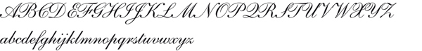
Linotype Shelley Andante, a 1972 design by Matthew Carter for Mergenthaler Linotype.
1.12 Graphics [FR: Manuaires, GE: Handschriftliche Antiqua]
Although a lot of confusion surrounds the distinction between scripts and graphics, the German terms clearly show the difference. The term Schreibschriften for the scripts, freely translated as script types, gives the origin but also the transition from an often elegant handwriting to a metal or digital typeface. The German term Handschriftliche Antiqua for the graphics denotes a different origin. The Antiqua are typefaces that originate from the Roman scripts from the 1.1 to 1.10 groups.
Adobe Tekton, a 1989 design by David Siegel based on the hand lettering of the American architect Frank Ching. Tekton is meant for lettering in architectural drawings and informal designs.
1.13 Gothic Types [FR: Caractères Brisés ou à Fractures, GE: Gebrochene Schriften]
Gothic types take their name from the era of gothic art and architecture in the Middle Ages, when the minuscule manuscript hands became narrower and more angular with breaks in the curves. Several styles that later developed out of these earliest forms are also called gothic. They display an ornamental aesthetic, but that also makes them difficult to read.
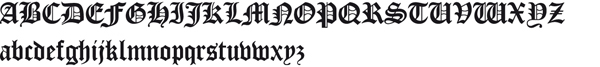
Cloister Black by Kingsley/ATF, a 1904 textura by Morris Fuller Benton and John W. Phinney.
Vox+2
The terminology that is used in the subdivision of the display letters in category 2 is deliberately international in character because the typefaces have no clear European, American or other common signature. Style characteristics, specific typographic features like kerning and spacing and the presence of certain (punctuation) marks are things that many designers in this category have not engaged with.
Back to top
2.1 Classic-Deco
These typefaces are made to catch the eye in advertisements and lettering to draw attention to merchandise. They therefore need to stand out and fit into the character of an era while remaining fairly legible. The appearance is adjusted to the product that needs to be sold. Well-known typefaces in this group are Art Deco typefaces but for instance, Western or fifties typefaces as well.

2.2 Typographic
Typefaces that greatly resemble the classic Vox+1 typefaces. Their use as text letter is limited, however, because their letter image is too detailed for reading texts, because they are incomplete (capitals only) or because they are an intentionally daring interpretation of a classic typeface. An example is the Radiorama of the Spanish Type-Ø-Tones, a Helvetica adaptation that mockingly adds serifs and other forms, and affects letters without adjusting letter width or line thickness.

2.3 Disorder
These typefaces arose at the start of the nineties of the twentieth century and partly got their inspiration from non-mainstream movements like punk (music). They are generally hastily made designs that are based on existing typefaces. Using manual or digital techniques, those typefaces are affected, eroded or deformed.

2.4 Techno
These are typefaces that are tight and sometimes look like they have been cut from or cast in metal. It is as if they are modularly constructed. When looking closer, this is not really the case, but a great number of basic forms are repeated.

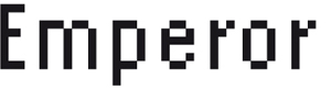
2.5 Modular
These typefaces are designed with the same modular form as their basis. Emigre was one of the agencies that pioneered this technique and experimented with it in the first editions of Emigre magazine. Examples are Modula and Emperor (both 1985).
2.6 Fantasy
This group brings together typefaces that look festive, are lavishly decorated or express exuberance in any other way.
Vox+3
The word pi in pi fonts derives from the metal era. Pi was an English printing term and meant metal type from set pages that had accidentally come apart and fallen into disarray. Characters that had no designated place in the type case were put in a compartment called the pi box, because it too contained a jumble of characters. Unsurprisingly, most pi fonts are a real mess. Although they are usually thematic, they do not have an easily traceable place on the keyboard.
Back to top
3.1 Ornaments
Ornaments have been around for a long time and were used before the advent of the printing press to illuminate handwritten books. The initials in medieval manuscripts are ornaments also. There are a number of other sources that can inspire designers: from Mexican ornaments in the Codex Borgia, art deco decorations and Cambodian murals to Keith Harings graffiti.
Sagember, a 1994 design by Marcus Burlile for T-26.
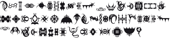
3.2 Symbols
Symbols are undoubtedly the most frequently used pi typefaces. Symbols for formulas, signposting, for cartography and for purposes that need to clarify something in a layout using general symbols.
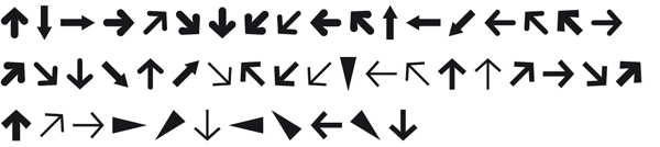
FF Dingbats Arrows One, a 1994 design by Johannes Erler for FontShop.
3.3 Pictograms
These are signs that ask a bit more of an audiences imagination than symbols. Pictograms, a combination of the Latin pictum (painted) and the Greek graphein (to write), are stylised pictures that can give an indication or information. They are almost always decorative and show their makers style. They are also called clip art fonts.
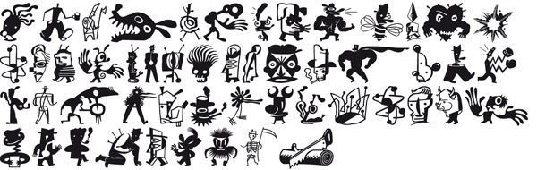
Zeitguys One, a 1994 design by Eric Donelan and Bob Aufuldish for Emigre.
======================================================================================
Leaf through Letter Fountain
A typeface category is a named group of typefaces displaying similarities, for example script types. A typeface or type family is a group of types closely related in design, designed to be used together and usually bearing the same name (with various modifiers), such as Rockwell or Helvetica. A font is a variant of a typeface, which can mean a different weight (bold or light), a different width (condensed or extended), a different angle (slanted or oblique), or even a different form (cursive or italic), or any of these parameters in combination, such as Helvetica 23 Ultra Light Extended Oblique. The standard, normal or regular version of a typeface is often called the roman. So a typeface may include various fonts. This means that if we buy a font for our computer, we only buy one version of a typeface. Mostly, however, a number of fonts such as Regular, Italic, Bold, and Bold Italic are sold as a set.
Back to top
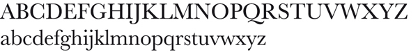
The Linotype typeface Serifa displayed in all available variants.
The 26 letters of the alphabet are only the core characters in a font. Without numerals, punctuation marks, special characters and accented signs, a font is not complete. And each language has its specific punctuation marks and ligatures, which were added to some fonts by the type designer.
UPPERCASE and lowercase letters
In handwriting and manuscripts, these letters are also known as capitals or majuscules and small letters or minuscules. The term capital letter derives from Roman inscriptional lettering cut in stone, to which the letters often owe their straight and incised features. Lowercase letters were only later added to handwriting.
Back to top
The Trajan typeface, designed by Carol Twombly for Adobe, is based on the Roman inscriptions on Trajans Column in Rome (dedicated in 113 AD).
The Blado typeface was revived by Stanley Morison in 1923 after a 1526 italic by Ludovico Degli Arrighi. Although it was an independent typeface, it was also intended for use as a companion italic for the Poliphilus roman (above), which Morison also revived for Monotype. The Arrighi italics are seen as the first cursive typefaces for use in printed matter.
The variants
Although it seems that the italic version of a typeface was there from the beginning, this is definitely not the case. The italic only came into being around 1500, and is derived from the Italian humanistic handwriting and chancery hands of the time. The italic was initially used as a text letter, designed from the economic cursive script.
Back to top
Stempel Garamond Roman shows that it is based on the roman, cut by Claude Garamond in the book Hypnerotomachia Poliphili (Jacques Kerver edition, 1546). Claude Garamond, for his part, had been inspired by the roman that Francesco Griffo cut about fifty years previously for the printer Aldus Manutius.
Small capitals
Small capitals are smaller versions of capital letters not reduced capitals, but especially designed small capitals, which can often be ordered with a certain type family as a so-called Expert or SC font. In height, these small capitals are slightly bigger than the x-height of lowercase letters, and they have a matching weight.
Back to top
Hans Eduard Meier's Syntax was first released by Linotype in 1968. It was the last sans-serif to be produced for both metal and phototypesetting. In the late 1990s the design was extensively revised, adding features such as the small capitals shown above/at left. Small capitals were first introduced c.1525. Five hundred years later, they are regarded as a related variant of a typeface, like the italic.
Ligatures, diphthongs and logotypes
Ligatures are combinations of characters that were designed because, in metal typesetting, the overhanging ascender in the letter f would crash into an ascender or the dot of an i if it directly followed the f. Logotypes are less clearly visible combinations of characters such as the ampersand or & symbol. This combination is also made up of ligatures. Typographic diphthongs or ligatured vowels are rarely used letter combinations. They mainly convey that a word has a special pronunciation. The French word il (eye) is such an example.
Back to top
In the & symbol of the Demos Italic and the Galliard Italic, the separate letters (et) are still clearly visible. In the Alega on the far right, the designer has departed from a clear picture of the combination. Although this combination strictly speaking forms part of the logotypes, it is more correct to call the Demos and Galliard version a ligature.
Parts of a Monotype Bembo Semibold letter. In red: a ligature with the contours of the individual letters f and i superimposed.
Numerals
It is generally held that as soon as writing systems came into being, people felt a need to describe quantities. A few centuries BC, the numbers we still use to this day popped up in India. At the time, they were used as a notation system in Hindu algebra. It was a highly evolved system, which the Arabs adopted during trade missions and conquests. These numbers are usually called Arabic numerals. Even though we would not be able to go without the zero nowadays, the earliest Hindu system had no symbol for it.
Back to top
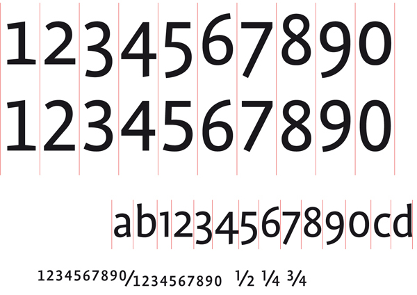
The figures from FF Profile below show oldstyle tabular figures (top row), lining tabular figures (second row) and oldstyle figures (OSF) (third row) shown in running text. These tabular figures all share a common width indicated by the vertical lines; the point is to make vertical alignment easy and consistent, and the foot serifs on the '1' have been added to counterbalance the greater white space surrounding the figure. Conversely, the third example shows proportional (non-tabular) figures, where the widths are dictated by the character shapes themselves, and no extra foot serifs are required. FF Profile also has specially drawn (and not just reduced!) numerals for fractions, superior and inferior numerals (shown at bottom).
Punctuation marks
A font usually contains a large number of punctuation marks, some of which can have very divergent forms like the single quotation mark, pictured below in different typefaces. Punctuation marks, just like the Roman numerals, were used in our writing system before the Arabic numerals. Commas, full stops, paragraph marks and hyphens were already used in handwritten books to support readability.
Back to top
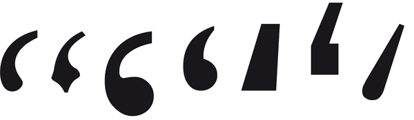
Quotation marks are very different in different typefaces and follow the design of the characters from the typeface. The examples are from different typefaces but have the same size in points.
The biggest stumbling block is, surely, the quotation mark. There are single and double quotation marks sometimes called six-nine because of their shape and order but also « guillemets », of French origin, which in Germany are used »the other way around«. For a quotation within a quotation, a different solution needs to be found, and the most elegant one in this case is using the double quotation marks, the sixty-six/ninety-nine, as the second set. So: a quotation within a quotation.
The single quotation mark, particularly the nine, has yet another function. In a word like doesnt or cats, it is called an apostrophe.
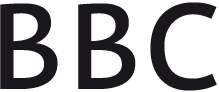
The full stop, in America called a period, is the punctuation mark that is used the most. A full stop ends a sentence or an abbreviation. Internationally recognised abbreviations or symbols of, for example, monetary units, measurements, weights and physical and chemical indicators are written without a full stop. A few of these abbreviations are: cm (centimetre), km (kilometre), °C (degree Celsius) and kg (kilogram). Another case is the abbreviations of names like BA, AA and BBC; these are usually capitalised and do not have full stops. When abbreviating days and months, no full stop is used. The first letter is, however, capitalised. For days: Sun, Mon, Tue, Wed, Thu, Fri, Sat and Sun. For months: Jan, Feb, Mar, Apr, May, Jun, Jul, Aug, Sep, Oct, Nov and Dec.
A full stop is usually not used after abbreviations of names.
The full stop is also used in number sequences. In English-speaking countries, a full stop is used as a decimal point while the comma or, recently, a space is used to present large numbers in a more readable form. So, for instance: 14,300.90 and 22,356 or 22 356.
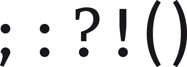
After the full stop, the comma is the most important punctuation mark. This is one of the most difficult punctuation marks to use because the right placement has a lot to do with a good sense of language. Therefore the author has primary responsibility. Comma usage increases readability, but practice shows that a comma is used too much, rather than too little.
It is difficult to know when a semicolon should be used. Often, a full stop or comma is used instead, even when a semicolon would be the better choice. The semicolon serves two purposes. Firstly, it is used to indicate the connection between two independent finite clauses. Secondly, it is used in lists that have internal punctuation.
The colon is easier to use. It is used to indicate that an explanation, description, elucidation or conclusion follows, and prior to a list. In general, the text after the colon starts with a lowercase letter, except when it is a quote or proper name.
The question mark is usually placed at the end of a sentence, with no space between the last word and the question mark. It replaces the full stop.
The exclamation mark is used in two ways: after an exclamation and for emphasis. It is placed, with no space, at the end of a sentence, replacing the full stop.
Brackets or parentheses are used to clarify, elucidate or add, or to refer. For instance: Reuters (London) is recruiting intern(s) (m/f) online (www.uk.reuters.com). Besides parentheses, there are square brackets. These are generally used to indicate [...] that part of a quote is omitted, or they are used insert an explanation that did not feature in the original text.
The oblique stroke or slash has seen a real revival since the advent of the internet. Although a slash online indicates a referral to a page deeper down in the hierarchy of a site, it has the following functions for running texts: to indicate a choice (m/f), in abbreviations (w/o) or as a linebreak when quoting from plays, poetry, etc. It is also used to replace the dash or hyphen when connecting words or sentences. The mirrored version of the slash, the backslash (\), is a symbol that was first added to an ASCII keyboard in 1961, to be used with the IBM 7030 supercomputer. The slightly more slanted version of the slash is the fraction (/). It is used for, indeed, fractions: ¼, 2/16. The vertical bar (|) nearly never occurs in normal texts but is sometimes used as a typographic styling element by designers.
And then there are the hyphens and dashes. They come in a variety of sizes. Hyphens are, first off, used as a symbol to break words. The second use of a hyphen is as a trait dunion. A hyphen is added when two consonants or vowels are pronounced separately rather than as a diphthong, for instance in bowl-like or anti-intellectual. It is also inserted when there is a chance of misreading, as for instance with co-worker (people might think a cow had an orker). Hyphens are also used to form compounds and to connect numbers and words in adjectival phrases. Finally, hyphenation is sometimes used for dates (9-8-1956), although slashes or full stops are more frequently used.
The en dash is longer than a hyphen and is used to demarcate a parenthetical thought or to indicate a sudden change of direction as in, for instance: Unfortunately the document to be discussed which you received via email is no longer up to date. Usually these dashes can be replaced by commas, or the phrase can be bracketed.
In the above, en dashes are used. When using a dash to replace the word to, a thin space is added before and after the dash. A space is added before the minus sign in case of degrees.
The em dash () is used to demarcate parenthetical thought in English texts, but the dashes are unspaced (without white spaces on either side).
The underscore (_) is a line that lies slightly below the baseline and has the same length as an en dash. (The underscore is often used in email addresses, computer filenames and website names)
Even though there are more punctuation marks to talk about, we have now discussed the ones that are most commonly used. It is advisable to look at these characters when choosing a typeface for a commission or a house style because they heavily feature in texts and so influence the styling.
Accents
These are called diacritics and they indicate a different sound or stress when used with a letter. There is a difference between widely used accents and special accents, used in for instance Central-European languages which are not available readily or at all in some typefaces.
Back to top
Other commonly used characters
Special pi fonts are developed for letters and characters that are not included in a font though still often used. Examples are: the Zapf Dingbats, with all kinds of symbols, and Symbol, which includes a lot of characters for scientific applications. There are symbols and dingbats for virtually everything. The most frequently used ones are the Greek letters and the mathematic symbols in the Symbol. It is not surprising that they are the standard font, supplied with most computers. Below right is an example of the Wingdings typeface.
Back to top
Type measurement systems
In typography, several different measurement systems are used besides the metric system. On the European continent, the so-called Didot point system used to be a standard, derived from the metal type era. In Britain and America, however, the Anglo-American point system is used. The inch has always been used for typewriters and (dot matrix) printers. As a result of automation and the use of pin-feed paper, the inch was introduced in the graphic industry. So, a total of four linear measurement systems are used.
Back to top
Metric or decimal system
The main difference with other measurement systems is that it is a decimal system. At an international congress held in Paris in 1795, the metre was established as the forty-millionth part of the earths circumference (unfortunately we do not know who measured this). The French (platinum) standard metre gained international recognition in 1889, with the exception of Britain, the Commonwealth and the United States.
Back to top
Didot point system
The Parisian type founder Fournier established a point system which he based on his own non-standard foot. Fournier developed it into a duodecimal system. Later, Fourniers system was revised by the type founder Didot. The Fournier point was a bit smaller than the Didot point, which was based on the pied du roi, a linear measurement that was accepted in the whole of France. An augustin or cicero contains 12 Didot points.
Back to top
Pica system
The pica system is the Anglo-Saxon counterpart of the Didot point system. The pica is also a duodecimal system which is divided into 12 points. However, the pica is somewhat smaller than the Didot. As it lacks international calibration, there is a lot of confusion about the pica. Because many printers in the graphic industry are American, the pica has become the type measurement unit which is most applied. According to the United Bureau of Standards a pica measures 0.351461 mm. However, the measurement units indicated in points in Letter Fountain are expressed in pica points as used in computer software. There, an inch is divided into 72 pica points (making 1 point the equivalent of 0.352777 mm).
Back to top
Inch
An inch is the Anglo-Saxon measuring unit of the duodecimal system. The inch is defined as 25.4 millimetre.
Back to top
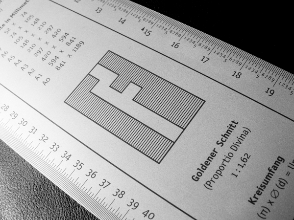
In 1997, the measuring set Mackie M was launched, a metal and larger version of the Letter Fountain ruler. Photo: Joep Pohlen.
Type body size
The type body size that we use to this day is a measuring unit that directly derives from metal type. To prevent the ascenders and descenders of successive lines from touching each other, letters were cast on a body slightly larger than the ascender-to-descender distance. The body size, in metal type, was indicated in points; in Anglo-Saxon countries using pica points; and on the European continent Didot points (with a cicero of 12 points). As type designers considered the space on the body to be the design area, characters with different image sizes occurred.
Back to top
Adobe Garamond (below left) has a much smaller type image than the American sans-serif (or Benton-Linéale) News Gothic on the right. Both have a body size of 145 pt. The example also shows the typically larger x-height that is characteristic for many American designs. This makes it obvious that 9 pt Adobe Garamond looks a lot smaller than 9 pt News Gothic.
Line spacing
If, in metal type, more space between lines was called for, thin strips of lead of one or more point(s) in thickness were inserted in between the lines of metal type. This insertion of extra white space was called leading. The line spacing, however, is the measured distance between the baselines of consecutive lines.
Back to top
Typefaces and their classification
The various attempts that have been made to organise the multitude of typefaces into clear categories have produced some valuable type classifications, none of them completely satisfactory. There are some methods that follow a chronological order, some that place the emphasis on the differences in form and others that look at whether a type derives from a manuscript or not. Categorisations of types may furthermore fill a purely theoretical need or may have a pragmatic search function. In this chapter a variety of classifications and divisions are discussed.
Back to top
The most frequently used classification for the division of typefaces by the French Maximilien Vox in 1954 had six categories. Below the extended ATypI version of 1962 with ten categories.
For Letter Fountain we are using one widely accepted classification: that of the Frenchman Maximilien Vox from 1954. This classification is based on form differences, but also works chronologically. In 1962, the classification was accepted as a standard by the Association Typographique Internationale (ATypI). In Germany, it was set down as DIN 16518 (1964) and in the UK as British Standard 2961 (1967).
As a large number of typefaces are ignored in this classification, we have amended and extended it at various points to do justice to typefaces that were designed after 1954, particularly the great many sans-serif typefaces that have been added. This is why we have divided the sans-serifs into four groups, so as to restore the balance between the seriffed types and sans-serifs for our time.
Vox+
On the following pages, an amended version of the Vox classification is discussed in detail. As names can differ in various countries, we have also added the French and German versions. As mentioned before, we have made some additions to the original classification as designed by Maximilien Vox. This is why we call it Vox+.
Back to top
Vox+1
Since the beginning of the computer era, the use of sans-serif typefaces has greatly increased. We therefore thought it necessary to reserve more space in the division for these sans-serifs. Form differences play an even greater part in Vox+ than in the original version. This is why the chronology somewhat takes a back seat.
Back to top
1.1 Humanistic [FR: Humanes, GE: Venezianische Antiqua]
The oldest Italian, mostly Venetian, printing type, designed at the end of the fifteenth century during the Italian Renaissance, are based on the handwriting of the humanists. This script went back to the Carolingian minuscule of the ninth century. In 1470, Nicolas Jenson, a French printer who worked in Venice, was one of the first to cut a refined humanistic typeface. This is generally seen as the prime example for the first group of types we use to this day: the humanists.
Omnibus Jenson Classico. This typeface was designed by Franko Luin after the original by Nicolas Jenson of the fifteenth century, and is distributed by Linotype Library.
1.2 Garaldes [FR: Garaldes, GE: Französische Renaissance-Antiqua]
Appeared during the French Renaissance period. The name garaldes is a contraction of the names of the French punchcutter Claude Garamond and of the Venetian printer Aldus Manutius. The first garaldes were based on the humanists, but they are more sophisticated, have narrower proportions and more fluent transitions.
Monotype Bembo. Stanley Morison designed this letter after the typeface that was first used in Cardinal Pietro Bembos De Aetna of 1495. Pay attention to Bembos characteristic capital letter R.
1.3 Transitionals [FR: Réales, GE: Barock-Antiqua]
The transitionals are the early neoclassical typefaces that appeared in the middle of the eighteenth century and were usually designed for a specific purpose. They are seen as the first types that were really designed. The transitionals mark the transition between the Renaissance and neoclassicism.
Monotype Baskerville. John Baskerville designed this typeface in 1757. Although his books were not a very big commercial success in England, his Baskerville was admired and much imitated.
1.4 Didones [FR: Didones, GE: Klassizistische Antiqua]
These are the late neoclassical seriffed types and their name is a combination of the French printing family Didot and the Italian printer Bodoni of Parma. The typeface Bodoni by Giambattista Bodoni, also known as the king of the typographers (principe dei tipografi) or printer to the kings, is seen as the highlight of the didones.
Bauer Bodoni and Omnibus Bodoni Classico. Bauer Bodoni (above) by Heinrich Jost is generally seen as one of the most beautiful revivals of the original Bodoni of the Manuale Tipografico. Bodoni Classico shows the version by Franko Luin with the slightly thickened serifs and horizontal parts for smaller texts.
1.5 Slab-serifs [FR: Mécanes, GE: Serifenbetonte Linear-Antiqua]
The slab-serifs are constructed typefaces and in general have hardly any thick-thin contrast. Some early slab-serifs are called egyptians allegedly after the popularity of the Napoleonic campaign in Egypt and the resulting interest in Egyptology. (Confusingly, many of the geometrically constructed slab-serifs designed a hundred years later all bear egyptian place names such as Karnak, Luxor, Memphis etc., but they have nothing to do with the shape of the earlier egyptians which used the Grotesque form as their basis.) The Clarendon typeface is so typical for this group that in some English classifications the term slab-serif is replaced with Clarendon.
Clarendon Light (b). A 1953 design by Hermann Eidenbenz for Haas, derived from an 1845 version by Robert Besley. The version above is by Bitstream.
1.6 Humanistic sans-serifs [FR: Linéales Humanes, GE: Serifenlose humanistische Linear-Antiqua]
Sans-serifs are typefaces that owe their essential form to writing. The French word linéal unsurprisingly means advancing in a straight line. They first appeared at the beginning of the nineteenth century (Caslon Foundry, 1812/14), but only in capitals. The first sans-serif with lowercase appeared in England in 1834. Towards the end of the nineteenth century, every self-respecting foundry had a number of sans-serif typefaces with several variants. The humanistic sans-serifs are different because they follow the proportions of the classical Roman capital for the capitals and the humanistic manuscript hand for lowercase letters.
Gill Sans, a 1928 design by Eric Gill for Monotype.
1.7 Neoclassical sans-serifs [FR: Linéales Classicistes, GE: Serifenlose klassizistische Linear-Antiqua]
The sans-serif neo-grotesques appeared as a result of the popularity of the Swiss style of typography after the Second World War. Sans-serif started to get used more and more frequently with the advent of the Helvetica in 1957, created by the Swiss Max Miedinger.
Neue Helvetica, a reworking of a 1957 design by Max Miedinger for Haassche Schriftgießerei.
1.8 Benton sans-serifs [FR: Benton-Linéales, GE: Serifenlose Benton-Linear-Antiqua]
These lineales are also called American gothics. The prototype of this group is Franklin Gothic by Morris Fuller Benton. These typefaces show a close relationship to the neoclassical sans-serifs.
Franklin Gothic Book, a design (1903-1912) by Morris Fuller Benton for American Type Founders.
1.9 Geometric sans-serifs [FR: Linéales Géométriques, GE: Geometrische serifenlose Linear-Antiqua]
The geometric sans-serifs seem to be drawn with ruler and compass. It takes a lot of skill to produce clearly legible typography with these typefaces. Good microtypography, such as choosing the right letter spacing and line interval, is very important.
Futura, a 1927 design by Paul Renner for Bauersche Gießerei.
1.10 Glyphics [FR: Incises, GE: Antiqua-Varianten]
The glyphics show a relationship with stone-cut or metal-cut letters. In Latin they are called litterae incisae and in French, lettres incisées. They are usually monumental, or, in other words, powerful, firm and simple, adapted to the restrictions of the material from which they are cut.
Monotype Albertus. From 1932 to 1940, Berthold Wolpe designed this typeface for Monotype. The forms clearly show that he based his design on letters that were cut in bronze, a technique in which the material is removed from around the letter. The form, in other words, came about from the outside of the letter and not, as is the case for most type designs, from the shape of the letter itself.
1.11 Scripts [Fr: Scriptes, D: Schreibschriften]
These are designed to look like handwritten letters and usually consist of cursive letter forms. In general, they are not suitable for long texts. Unlike the graphics (see 1.12) these are typefaces that have been drawn digitally, but imitate handwriting.
Linotype Shelley Andante, a 1972 design by Matthew Carter for Mergenthaler Linotype.
1.12 Graphics [FR: Manuaires, GE: Handschriftliche Antiqua]
Although a lot of confusion surrounds the distinction between scripts and graphics, the German terms clearly show the difference. The term Schreibschriften for the scripts, freely translated as script types, gives the origin but also the transition from an often elegant handwriting to a metal or digital typeface. The German term Handschriftliche Antiqua for the graphics denotes a different origin. The Antiqua are typefaces that originate from the Roman scripts from the 1.1 to 1.10 groups.
Adobe Tekton, a 1989 design by David Siegel based on the hand lettering of the American architect Frank Ching. Tekton is meant for lettering in architectural drawings and informal designs.
1.13 Gothic Types [FR: Caractères Brisés ou à Fractures, GE: Gebrochene Schriften]
Gothic types take their name from the era of gothic art and architecture in the Middle Ages, when the minuscule manuscript hands became narrower and more angular with breaks in the curves. Several styles that later developed out of these earliest forms are also called gothic. They display an ornamental aesthetic, but that also makes them difficult to read.
Cloister Black by Kingsley/ATF, a 1904 textura by Morris Fuller Benton and John W. Phinney.
Vox+2
The terminology that is used in the subdivision of the display letters in category 2 is deliberately international in character because the typefaces have no clear European, American or other common signature. Style characteristics, specific typographic features like kerning and spacing and the presence of certain (punctuation) marks are things that many designers in this category have not engaged with.
Back to top
2.1 Classic-Deco
These typefaces are made to catch the eye in advertisements and lettering to draw attention to merchandise. They therefore need to stand out and fit into the character of an era while remaining fairly legible. The appearance is adjusted to the product that needs to be sold. Well-known typefaces in this group are Art Deco typefaces but for instance, Western or fifties typefaces as well.
2.2 Typographic
Typefaces that greatly resemble the classic Vox+1 typefaces. Their use as text letter is limited, however, because their letter image is too detailed for reading texts, because they are incomplete (capitals only) or because they are an intentionally daring interpretation of a classic typeface. An example is the Radiorama of the Spanish Type-Ø-Tones, a Helvetica adaptation that mockingly adds serifs and other forms, and affects letters without adjusting letter width or line thickness.
2.3 Disorder
These typefaces arose at the start of the nineties of the twentieth century and partly got their inspiration from non-mainstream movements like punk (music). They are generally hastily made designs that are based on existing typefaces. Using manual or digital techniques, those typefaces are affected, eroded or deformed.
2.4 Techno
These are typefaces that are tight and sometimes look like they have been cut from or cast in metal. It is as if they are modularly constructed. When looking closer, this is not really the case, but a great number of basic forms are repeated.
2.5 Modular
These typefaces are designed with the same modular form as their basis. Emigre was one of the agencies that pioneered this technique and experimented with it in the first editions of Emigre magazine. Examples are Modula and Emperor (both 1985).
2.6 Fantasy
This group brings together typefaces that look festive, are lavishly decorated or express exuberance in any other way.
Vox+3
The word pi in pi fonts derives from the metal era. Pi was an English printing term and meant metal type from set pages that had accidentally come apart and fallen into disarray. Characters that had no designated place in the type case were put in a compartment called the pi box, because it too contained a jumble of characters. Unsurprisingly, most pi fonts are a real mess. Although they are usually thematic, they do not have an easily traceable place on the keyboard.
Back to top
3.1 Ornaments
Ornaments have been around for a long time and were used before the advent of the printing press to illuminate handwritten books. The initials in medieval manuscripts are ornaments also. There are a number of other sources that can inspire designers: from Mexican ornaments in the Codex Borgia, art deco decorations and Cambodian murals to Keith Harings graffiti.
Sagember, a 1994 design by Marcus Burlile for T-26.
3.2 Symbols
Symbols are undoubtedly the most frequently used pi typefaces. Symbols for formulas, signposting, for cartography and for purposes that need to clarify something in a layout using general symbols.
FF Dingbats Arrows One, a 1994 design by Johannes Erler for FontShop.
3.3 Pictograms
These are signs that ask a bit more of an audiences imagination than symbols. Pictograms, a combination of the Latin pictum (painted) and the Greek graphein (to write), are stylised pictures that can give an indication or information. They are almost always decorative and show their makers style. They are also called clip art fonts.
Zeitguys One, a 1994 design by Eric Donelan and Bob Aufuldish for Emigre.
======================================================================================
Leaf through Letter Fountain