
Calypso PF by Roger Excoffon.
Free download!
Free download!
> Download Calypso PF for Mac and Windows
Almost every typeface that was available in metal type is digitized since the early nineties of the last century. However, we discovered that the digital versions of Calypso (Roger Excoffon) did not meet our expectations. So, we decided to make our own version based on metal type, cast recently from the original matrices from Fonderie Olive (and not used for print). Roger Excoffon was a designer that made some of the most remarkable typefaces in his time. Examples are Antique Olive, Mistral, Choc and Banco. They all had a French touch with an open mind of doing things different. Antique Olive was an answer on the success of Helvetica and Univers. Excoffon did not copy blind like many others but made a typeface that has its own and distinctive character. Calypso was also a typeface that had no competitors. We like the unconventional character of this typeface. It is highly redundant and the readability is bad. And yet it is wonderful like many other designs from Excoffon. And isn't less more? Download Calypso PF and make a tribute to this designer! Look also at 'The making of Calypso PF' on YouTube: http://www.youtube.com/watch?v=UTbwg7Sz4Xc
Back to top
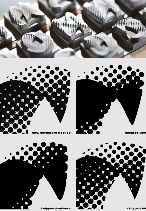
Lecture on the choice of a typeface
> Download Lecture on the choice of a typeface
This lecture deals with the choice for a particular typeface and the categorization of available typefaces using the classification of Vox. This classification was published in 1954 by Maximilien Vox. Since that time so many new typefaces are published that the classification had to be updated to the present time. In the book Letter Fountain you can find a updated version that is called Vox+. In this lecture a part of this updated version is presented with a lot of examples. In the supplied Word-file there is an explanation for every sheet and the sheets are supplied in a PDF file. Please let us know when you find an error in one of the documents.
Back to top
Lecture on the history of type
> Download Lecture on the history of type
This lecture on the history of type deals with the first forms of communication from more than 15,000 years ago until book typography in the present time. It shows many examples of books and in the supplied Word-file there is an explanation for every sheet. The sheets are supplied as a PDF file. Please let us know when you find an error in one of the documents or when you find incorrect information.
Back to top
Letterforms handout
> Download Letterforms handout
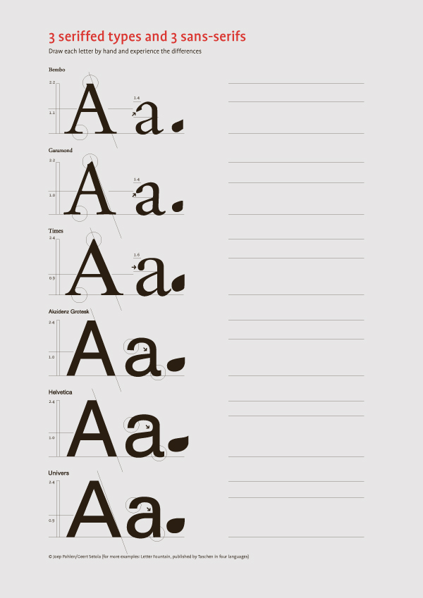
This exercise, used in education since the first publication of Letter Fountain, helps students to learn the differences among three similar seriffed typefaces and three frequently used sans serifs. Drawing these letters by hand helps students become more aware of the subtle differences that influence the typographic effect of using them in layouts. In this handout only the capital A and the lowercase a are shown, but in the printed Letter Fountain you will find the complete alphabet.
Back to top
> Download Timeline typography and art
This exercise, used in education since the first publication of Letter Fountain, helps students to learn the differences among three similar seriffed typefaces and three frequently used sans serifs. Drawing these letters by hand helps students become more aware of the subtle differences that influence the typographic effect of using them in layouts. In this handout only the capital A and the lowercase a are shown, but in the printed Letter Fountain you will find the complete alphabet.
Back to top
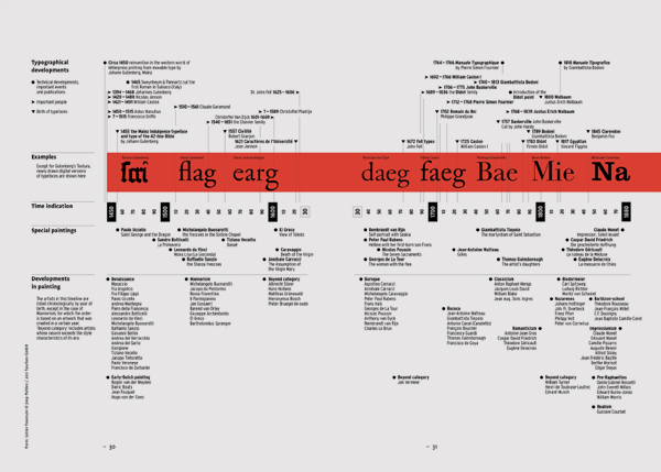
Timeline typography and art
> Download Timeline typography and art
This timeline correlates historical type designs with landmarks in the fine art and design movements. Art, design, and typography have fed each other for many centuries. For this reason, this timeline has proven to be extremely valuable for educational purposes (and is one of the most copied parts of the book).
Back to top
> Download Timeline of type publishers
Back to top
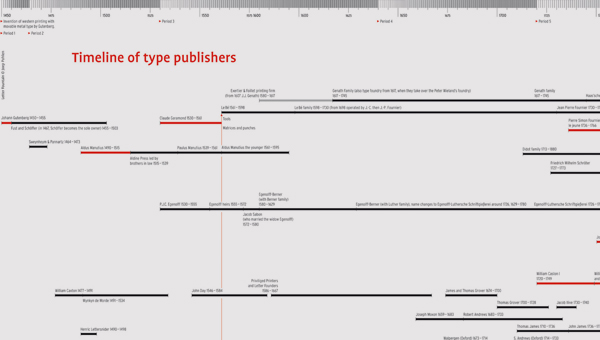
Timeline of type publishers
> Download Timeline of type publishers
This unique timeline is a graphical representation of the extensive index of type companies included in Letter Fountain. This timeline traces how type publishers developed over the years, competing and merging and spawning new companies. It identifies the most important periods for innovative type design and materialsthe progressive steps that have brought us to where we are today.
Back to top
Back to top
Bibliography
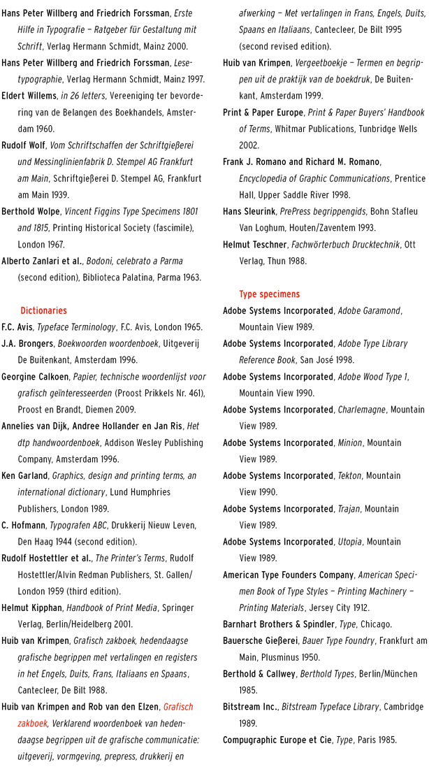
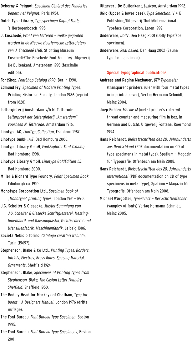
Dozens of books, type specimens and publications were used in the making of Letter Fountain. The history of typography is, after all, largely based on the written and printed word. With this book, we stand on the shoulders of those who made the effort to commit to paper the knowledge and skills they acquired. Titles of books that have made an above-average contribution to Letter Fountain are rendered in red. Publications that are no longer available in bookstores can usually be found on the internet. Dictionaries, type specimens and special editions are grouped under separate headings. The bibliography is confined to book-like publications.
Back to top
======================================================================================
Back to top
======================================================================================