Digital aesthetics
In the modern-day world of the media, the book type is no longer the standard. While the illusion of the global village is propagated via the internet, cultural and ethnic disintegration are taking hold of large supranational and national groups. Smaller social groups, often spread at random throughout the world, affirm themselves with their own ways of thinking, their own professional profiles, their own norms, their own language, their own fashion statements and their own design and visual communication codes.
Back to top
The influences of punk and graffiti
In the 1970s, the years of punk, young people began to develop their own code of communication. In the exciting, mildly illegal world of messages sprayed on walls, a strongly coded picture-writing came into existence, which was almost a secret language and in which the shapes, the graffiti, were a source of inspiration for both an artistic movement with Keith Haring as figurehead and a new idiom in the world of graphic design. Graphic designers looked with Argus eyes at the freedom of colour, letter and image and began sketchy experiments with the elasticity of the letter as a shape and as a representation of its meaning.
Back to top
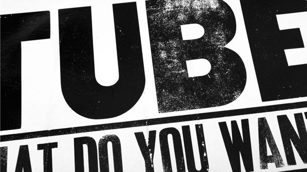
Typography on an album of the punk group The Tubes. It clearly shows that the letters have been deliberately distorted. These typefaces are generally traditional in character. Photo: Joep Pohlen.
The magazine as catalyst
In a number of magazines aimed at a younger audience and in designs for new record companies and for progressive television stations there emerged a new class of designers with an experimental approach to ideas and techniques and who were exploring the monumental, autonomous possibilities of expression with type. From the early 1980s, graphic designer Neville Brody found his influences in punk and Dadaism for his work for the English magazine The Face. He shared the opinions of designer Wolfgang Weingart from Basel, whose reaction against the hegemony of the Swiss international style is referred to as new wave typography, and who stated that legibility is not the same as easy to read.
Back to top
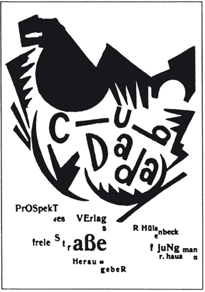
New forms, old sources. Above, a cover of the magazine Club DaDa from 1918. DaDa was one of the sources of inspiration for designers like Neville Brody and Art Chantry.
The type industry ploughed forth
Aside from the wild young designers who attempted to force a breakthrough with their designs, the type industry was still shaped by a heavy ballast of hundreds of years of tradition and bulky typesetting machines. When phototypesetting machines slowly began replacing the mechanical typesetting machines during the 1970s, designers Herb Lubalin and Aaron Burns set up the International Typeface Corporation (ITC). Their innovation was that ITC designed and introduced typefaces that did not take into account the restrictions of typesetting machines. The design itself was the starting point.
Back to top

Avant Garde Gothic was one of the first typefaces released by ITC. It is named after the magazine Avant Garde, where Herb Lubalin was art director. Avant Garde was designed with extreme spacing and unique ligatures (see above). These were later omitted from the PostScript version but were re-introduced in the OpenType version released by ITC in 2005.
The first digital type company
Type designer Matthew Carter and divisional manager of Linotype Mike Parker decided to begin their own company in 1980, with the focus purely on design and distribution. They called it Bitstream. They were supported by young producers of hardware such as Scitex that had developed powerful digital machinery but who did not have time to design their own typefaces. Bitstream filled the gap in the market and set to work with its own collection.
Back to top
Ordinary letter production
It seems as if this period was dominated by technique and to a certain degree this was the case. The new photographic and digital techniques required a great deal of adaptation, but at the same time there was also a great deal of aesthetic innovation in the primary typographic process. In 1975, AT&T commissioned Matthew Carter to design Bell Centennial. The letters contain so-called ink traps, which compensate for the effects of ink flow on thin, absorbent paper during the process of printing telephone books.
Back to top

Bell Centennial by Matthew Carter with its characteristic ink traps.
Emigre
Dutch designer Rudy VanderLans graduated in 1980 and then began working at the studios Vorm Vijf and Tel Design in The Hague, but was disappointed that his work was not more creatively challenging. The work of many larger bureaus consists partly of creating corporate identities, where the production process itself actually takes up more time than the creative process. He decided to spend some time travelling through America and enrolled as a student at the University of California at Berkeley, where to his surprise he was immediately accepted. There he met Zuzana Licko, whom he married in 1983. With a few other Dutch designers who had also travelled to the West Coast, VanderLans created the magazine Emigre. The first issue was designed completely with typewriter typography and photocopied photos. Licko was very interested in computers and quickly began to experiment and to programme. In 1984 VanderLans and Licko purchased one of the first Macs, with 128K of memory. Licko subsequently began to design low-resolution typefaces with the FontEditor programme that was available as public domain software. The first typefaces they designed were Emperor, Emigre and Oakland, made for use on the dot matrix printer. In Emigre 2, published in 1985, Emigre and Oakland were used for the first time in sections of the text. Unique to Emigre is that Zuzana Lickos development as a type designer stemmed from the techniques available and was particularly linked to the arrival of the computer as replacement of traditional typesetting machinery. Although she received a lot of criticism about the legibility of her texts, this lessened over time.
Back to top

Oakland and Emperor by Zuzana Licko. The numbers Eight, Fifteen and Nineteen refer to the pixel height of the capitals. Below is the lowercase g of Oakland Eight. The number of pixels can easily be counted.
FontShop
In his first book, The Graphic Language of Neville Brody, released in 1988, Neville Brody states that he had nothing to do with what he considered the too-easy computer, but he subsequently set up the type foundry FontShop in 1990 together with Erik and Joan Spiekermann. Many type foundries were founded around 1990 but FontShop, like Emigre, spent the following years building a consequently sound collection, which now includes several thousand typefaces. Between 1991 and 2000, Neville Brody and Jon Wozencroft together published the Fuse series under the flag of FontShop. Four designers per publication were asked to submit an experimental typeface that had been designed especially for Fuse. The publication was presented in a cardboard box and included a floppy computer disk with the typefaces in PostScript format and four posters, one by each designer. A number of the typefaces were later completed and included in FontShops FontFont collection. Dozens of famous type and graphic designers took part in this exercise.
Back to top
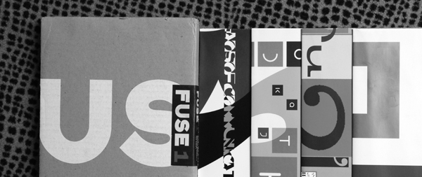
Fuse 1 from the summer of 1991. The box contains four folded posters, one for each of the four typefaces included. From left to right: F State by Neville Brody, F Stealth by Malcolm Garrett, F Can You ...? by Phil Baines and F Maze by Ian Swift. Photo: Joep Pohlen.
Linotype
This type company, which is home to a great tradition in the world of type design, almost missed the boat in the early days of digital type. After Bitstream had tried in vain to acquire licences, Adobes request in the mid-eighties was granted and URW in Hamburg began digitising famous Linotype typefaces such as Helvetica, Univers, Optima and the Frutiger. This was followed in 1990 by the fusion with the firm Dr. Ing. Rudolf Hell GmbH, a pioneer in the area of digital typesetting. The type collection at Hell consisted almost exclusively of relatively new designs by Dutch designer Gerard Unger and German designer Hermann Zapf. This collaboration once again saw the light of day in 1997 in Heidelberg Druckmaschinen AG. Heidelberg named the type library Linotype Library and in 2005 this was shortened to Linotype, which is now a component of Monotype Imaging.
Back to top
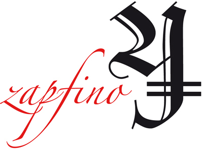
Two calligraphic typefaces from the Linotype collection. Wilhelm Klingspor Gotisch was designed in 1925 by Rudolf Koch. Zapfino by Hermann Zapf dates from 1998 and is a true digital typeface that was never made for metal typesetting. In fact it could not have been, due to the fine overlapping lines and the intersecting ascenders and descenders.
In 1996 Linotype also launched a significant project under the direction of Olaf Leu to develop a typeface specifically for annual reports. Olaf Leu and his team came to the conclusion that it should initially be a typeface with four styles and four versions. After a thorough comparison of existing typefaces, a list of advantages and disadvantages was formulated and the Compatil was made in four versions: Compatil Exquisit (a humanistic), Compatil Fact (a sans-serif), Compatil Letter (a slab-serif) and Compatil Text (more transitional than didone). In total it comprises sixteen styles with small capitals and Central European character sets. A unique feature is that the four different typefaces can be interchanged because the overall text width is the same in each version.
Back to top

The examples above clearly show how systematically the Compatil is constructed and how the width of all four styles is consistently equal without the whole appearing forced or out of balance.
Berthold
The story of Berthold is very different. Even though designer Günter Gerhard Lange returned in 2000 in his senior years as artistic director, the company never regained its leading role in the industry. At Berthold, Lange designed typefaces such as Concorde, AG Book, Arena and Imago and above all he designed various revivals of typefaces like Baskerville, Bodoni, Akzidenz Grotesk and Garamond. Also noteworthy in the Berthold system is that the cap height is given in millimetres and serves as a measurable font size.
Back to top
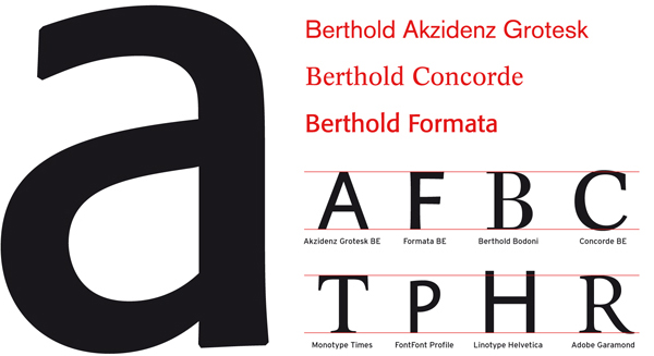
Above, the lowercase a from Formata. Right, some designs from Berthold and below them a series of typefaces from Berthold with a font capital size of 18 mm. Below that, a series of typefaces from other foundries that each has a different capital height at a font body size of 54 pt.
Monotype
Monotype is one of the most prominent suppliers of typesetting machinery and typefaces. Just like Linotype and Berthold, Monotype landed in a crisis when the arrival of the Mac made its hardware obsolete. A wave of new owners came and went. In 1998, Agfa (with the former Compugraphic library) took over Monotype and combined their typefaces under the collective name Agfa Monotype. In 2000, the International Typeface Corporation collection (ITC) was added, which had previously taken over the Letraset library, and under direction of a new owner the company name was changed to Monotype Imaging. Monotype has since also taken over Linotype.
Back to top

ITC Legacy is a design by Ronald Arnholm from 1992 with a Serif and a Sans. The Serif Bold is shown here.
Adobe Type Library
This collection was started in 1984 to help boost Adobes sales of software products and desktop publishing as a whole. It is a credit to Adobe that the quality of its typefaces for use in its own software was taken seriously right from the start. The Adobe Type Library is a purely digital collection and brings with it no excess baggage from the traditions of the industry. In order to make a quick start, licences were purchased for the bestsellers from other suppliers. Adobe has also always respected artists rights and requested licences right from the beginning.
Back to top

Above, Myriad from 1992, Nueva from 1994 and Chaparral from 1997 by designer Carol Twombly. All are OpenType versions.
Industrious type designers
If you can do it yourself, then why not do just that? More and more type designers came to the realisation that they could promote and sell their own work on the internet. The whole process ultimately begins with the designer. The smaller font suppliers should certainly be and now often are taken seriously and some offer typefaces that equal those of the most famous firms in quality. Jean François Porchez began his own type publishing company after having his FF Angie published by FontShop. Lucas de Groot released the successful FF Thesis through his own company LucasFonts and David Quay began The Foundry after having designed various typefaces for Letraset and Quay Sans for ITC. The American company Font Bureau was also started in this way in 1989 by founders David Berlow and Roger Black. They designed mainly custom (body text) typefaces for publications like the New York Times and Newsweek. Tobias-Frere Jones designed the popular Interstate for Font Bureau and later began his own company with Jonathan Hoefler. In 1991, Matthew Carter left Bitstream, which he had co-founded, and started a new company Carter & Cone together with Cherie Cone.
In Germany there are a few bureaus that are not predominantly active in designing but that provide services between the producer and the user. Elsner + Flake is the design studio of Veronika Elsner and Günther Flake from Hamburg, founded in 1986. They have digitised typefaces for authoritative producers such as ITC, and expanded them with euro symbols and Central European symbols. Turkish, Greek, Arabic and Hebrew typefaces are also available in the ever-growing Elsner + Flake library. Over time they have made their own designs and added revivals and display fonts to their collection. The second Hamburg-based studio to be involved in the digitisation of typefaces from the beginning of the digital era is URW++. Directed by Peter Karow, URW (without plusses in the beginning) developed the programme Ikarus, which was used in the early days of the digital era by large foundries such as Linotype, Monotype and Berthold for the digitisation of typefaces.
In The Netherlands there are still a few type companies that work in a typographic tradition to supply typefaces mainly for use in books. The first is The Enschedé Font Foundry (TEFF). The printing company Joh. Enschedé en Zonen was founded in 1703 and is renowned for its high-quality printing of bank notes, postage stamps and other unique works. The company purchased the type foundry of Hendrik Floris Wetstein in 1743 and began producing its own typefaces. Famous names have since worked for or at Enschedé, including Joan Michael Fleischmann, Jan van Krimpen and Bram de Does. In 1978 Enschedé commissioned De Does to design a new typeface for the phototypesetting system at Enschedé to commemorate its 275th anniversary. This typeface became Trinité. The demand for Trinité was what led Peter Mathias Noordzij to begin TEFF in 1991, thereby continuing Enschedés tradition of craftsmanship into the digital era. In 1992 Lexicon was introduced, originally designed specifically for the dictionary publisher Van Dale. Fred Smeijers designed the Renard, Gerrit Noordzij the Ruse and Christoph Noordzij the Collis. It is a small company with beautiful, classical typefaces for the discerning user.
Back to top
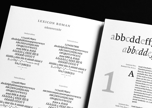
Above The Enschedé Font Foundrys 1997 specimen, designed by Marie-Cécile Noordzij, of Bram de Doess Lexicon. The right-hand page clearly shows the different ascender and descender lengths of the various Lexicon styles. The aim of this was to minimise the line spacing, therefore making the face of the letter as large as possible in the typographic and aesthetic balance between legibility and the bulk of a dictionary. Photo: Joep Pohlen.
A second producer is Dutch Type Library (DTL) that, like TEFF, specialises in typefaces for books. Founded in 1990 by Frank Blokland, it aims at supplying high-quality typefaces of Dutch and Flemish origin. Their production levels are higher than at TEFF with half the typefaces new designs and the rest re-releases and revivals. Type designers are asked by Blokland to create a design, and then the subsequent technical processes are carried out by DTL. Re-releases are Albertina from 1960 by Chris Brand and Haarlemmer, designed in 1938 by Jan van Krimpen but never previously put on the market. Both were originally made for Monotype.
Back to top
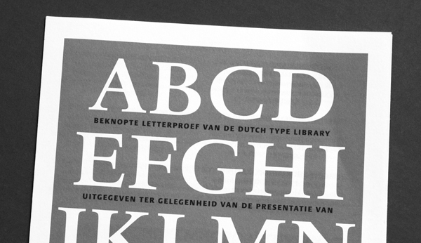
Above, Haarlemmer from a 1998 DTL type specimen. Photo: Joep Pohlen.
Autonomous type design
As well as the two extremes of the spectrum, the legible and the illegible typography and all the in-between forms with their corresponding typefaces, there are also designers who take experimentation as their starting point. They explore the boundaries of typography and type design. The Frenchman Pierre di Sciullo is one such designer. He received the Charles Nypels Prize in 1995 for his typographic experiments. He has produced the magazine Qui? Résiste (www.quiresiste.com) since 1983, in which he experiments with quotes, collages and transformations.
Back to top
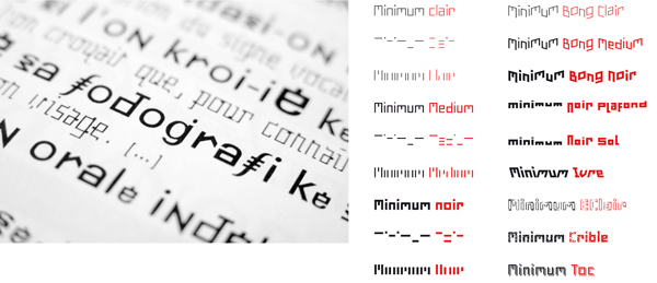
Left, Sintetik by Pierre di Sciullo, with the word photography clearly visible, spelled phonetically. On the right, his FF Minimum, which was released by FontShop. Below the Clair, Medium and Noir styles in the first column are the Horizontal and Vertical styles that comprise only the horizontal and vertical lines of the text.
The Dutch designer Max Kisman, many of whose designs can be found in the Fuse series, was experimenting with computers to make new designs even before the introduction of the Mac. In 1986 he and some friends began the magazine TYP/Typografisch papier, which has since then been sporadically produced. The Dutchmen Erik van Blokland and Just van Rossum joined forces to create the studio LettError, winning the Charles Nypels Prize in 2000 for their typographic innovations. They treated the letter as an actor who received instructions via the computer about how he should appear. Each letter can act differently, as in the typeface Beowolf from 1990 where the contour is defined at random, within certain limits. FF Beowolf was also one of the first typefaces of the then-young FontShop.
Back to top
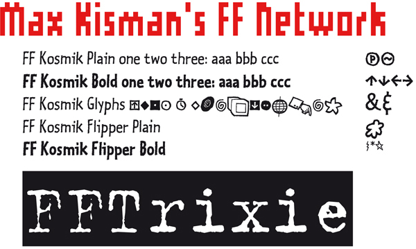
Above, Network by Max Kisman, a typeface similar in form to the letters he drew in the Tegentonen posters for Paradiso in Amsterdam. Beneath this is Kosmik by LettError. Both the Plain and the Bold have three styles with alternative characters so that the illusion can be created that the text has been handwritten. The Kosmik Glyphs are symbols. At the bottom, Trixie by Erik van Blokland.
In 1992 in Spain, Type-Ø-Tones was founded by four designers: Joan Barjau, Enric Jardí, Laura Meseguer and José Manuel Urós. Production halted in 1999 and their typefaces became available for purchase through FontShop. The collection consists solely of display typefaces. Laura Meseguer, who had previously designed several typefaces for Type-Ø-Tones, decided to follow the Type and Media course at the KABK in The Hague, where she then designed Rumba, a typeface comprising the three styles Small, Large and Extra. Rumba was awarded a TDC Certificate of Excellence in 2005.
Back to top
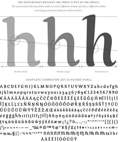
Three different forms of Rumba by Laura Meseguer. Below, the complete character set of the Rumba Small. With thanks to Laura Meseguer for the PDF of the typeface.
Two other Spanish designers, Andreu Balius and Joan Carles Perez Casasín, founded the Typerware bureau in 1993. The project in which they made their experimental type designs public, through a website and through printed publications, was called garcia fonts & co. These typefaces were not for sale; they could only be swapped for typefaces by guest designers who would then be included in the garcia fonts & co. project. Type designs by FF FontSoup, ITC Belter and ITC Temble are for sale at Typerware. Balius now has his own type foundry called Type Republic, offering several renowned typefaces such as the classical Pradell (2000 2003), inspired by designs of the Catalan punchcutter Eudald Pradell (1721 1788).
Back to top
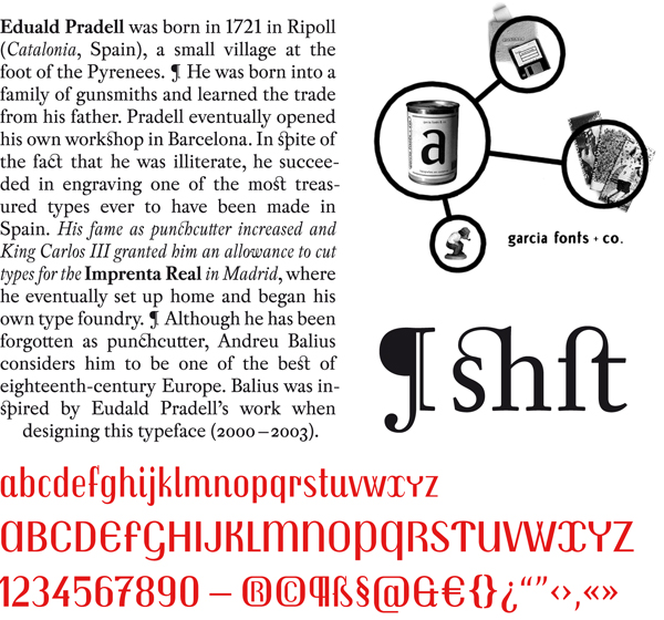
Pradell (above) and Trochut (below) are designs by Andreu Balius, who was inspired by old Catalan typefaces.
The Englishman Jonathan Barnbrook from the Virus type company began designing typefaces because he believed that designers had significant influence on elements such as image and layout in a design, but not on the typeface. When he got hold of the FontStudio programme in 1989, he finally had the feeling that he had complete control. At Emigre, Barnbrook published the typefaces Exocet and Mason. There are a great many examples of designers that began in the rough years of digital type design, when there was a certain amount of competition to design the most extreme type, and who then returned to the more classical traditions of the industry.
Back to top
Bukva:Raz!
Organizations founded specifically to serve typography and type design, such as the Association Typographique Internationale (ATypI) and the Type Directors Club (TDC), like to keep a finger on the pulse of developments within the industry. But type companies such as Linotype are also interested in market developments. This is why competitions are held. The TDC does this every year and publishes a book containing the winners. In 2000 the ATypI organized a competition for the first time since its establishment in 1957 and called it Bukva:Raz! From the six hundred submissions, they chose one hundred type designs, including not only Latin typefaces but also Arabic, Hebrew, Cyrillic and Greek designs. They are all illustrated in the book Language Culture Type, published by Graphis and ATypI. The hundred typefaces from the Bukva:Raz! selection show how much has changed over the last two decades and that the worldwide select group of designers has expanded to include a selection of hundreds of designers who are fascinated with both past and present. But most noteworthy is that many of the designs recognised by Bukva:Raz! also come from countries like Russia, Portugal, Mexico, Armenia and Argentina and even more surprising is that many of these are designs that cannot be categorised according to their geographical origins.
Back to top
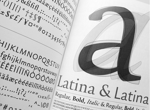
Latina, by the Spanish designer Iñigo Jerez Quintana, with a Sans and a Serif. The designer himself says this greatly extended type family may never be finished. The Latina is not yet available but did appear in the book Language Culture Type. Photo: Joep Pohlen.
Typography has a threefold purpose: first, to rouse peoples interest to read a text; second, to enhance legibility; and finally, typography determines the direction and speed of reading. These general typographic purposes are furthermore influenced by two other factors: the clients intentions and the graphic designers or typographers personality. The intentions of a client are expressed in the feel of a text: Is it long or short, informative or attractive, narrative or demonstrative? The choice of medium is also important: Is it a reading or study book, a magazine or a company brochure, a poster or a business card? Whereas, in order to limit the size, a book will require a type that is more economical, this may be less imperative in case of a brochure. A designers or typographers personality, on the other hand, can express itself in either a certain sobriety or a more elaborate use of form and colour.
The general purpose, mainly aimed at serving the reader, is obviously governed by certain rules. It needs to be explicitly stated, however, that every conceivable rule only becomes truly interesting by the grace of its possible exceptions. Or, as a famous designer answered when asked why he had suddenly turned his back on his own strict pattern typography after forty years: I invented the system, so I can fuck the system.
Still, some recommendations for making texts optimally legible have arisen by experience. These recommendations are partly based on the tradition of setting metal type but have also resulted from computer typesetting and editing. Trying out different versions and changing details is done much more quickly on a computer. In this respect, todays typographers are in much closer contact with the end product than during the long period of metal type and the ensuing typographic interbellum, when hot metal typesetting and phototypesetting were used together, and digital typesetting started its advance in printing offices.
Back to top
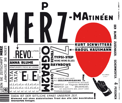
Dadaism or dada began in Zürich, Switzerland, but was soon adopted by artists in various other countries. Dadaism played with form and content. This illustration, designed by El Lissitzky, is an example of the style.
The first step
As indicated before, typography has a threefold purpose that, from a users point of view, can be divided into three steps. The first step is the first impression a page makes. This impression often determines whether or not a reader is interested enough to begin reading. Whether the text may be read or must be read is, of course, an important difference. The first example could be a newsletter or magazine where the choice to read or not lies with the reader. The second text could be the theory needed for a driving test or perhaps an instruction manual on how to fill out your tax returns. In the first example, an attractive layout is obviously more logical because the reader needs to be persuaded. In the second example, the informative character is more important because the reader needs to be able to clearly and easily take in the information.
Back to top
The second step
Enhancing legibility is the second step, which goes deeper than a texts first impression. This stage goes one step beyond asking for attention by means of catchy headlines or a provocative picture. In the case of quality newspapers, by the way, steps one and two can be rolled into one. This second step, however, expressly deals not only with first impressions and encouragement, but also with typographic attention on both word and letter level. This is what we call microtypography, which is all about the detailing of headings, grades, spacing, line interval, line length, ensuring register, indents, tabs, white lines, the alignment of the text, word breaks, the use of punctuation marks, the use of numerals and ligatures, the placement of initials, the proportion of captions and footnotes to the body text, the placement of illustrations in a text, the layout of tables, etc.
Back to top
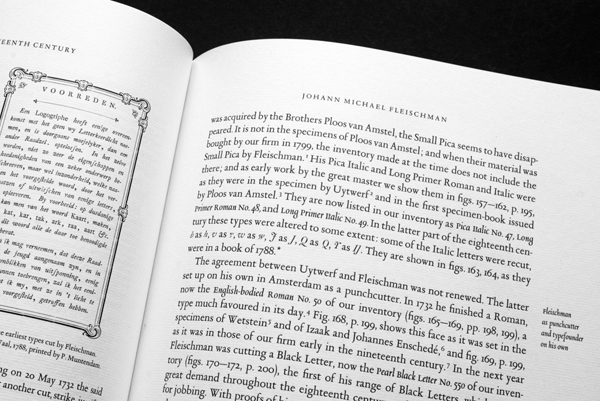
The text typography here is largely concerned with legibility and microtypography.
The third step
Equally important are the direction and speed of reading. A number of ways of reading can be distinguished, each demanding a different solution.
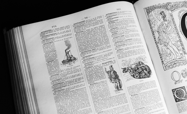
This spread from the Larousse Universel of 1923 shows an example of a layout that is aimed at a scanning way of reading. The eye is caught by the words in bold in the three columns and of course by the wonderful drawings that have been placed in the text. Photo: Joep Pohlen.
Paper and page size
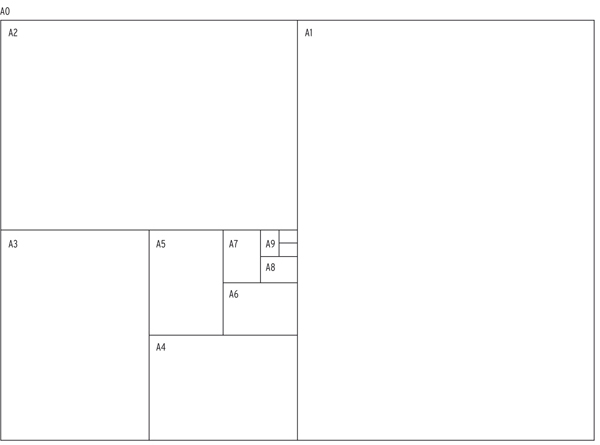
Because of a thorough standardisation, normalised DIN A sizes are usually the starting point for paper sizes for printed matter. The sizes of the sheets of paper that are supplied by paper manufacturers are based on these DIN A sizes, with a bit added for trimming, the gripper margin of the printing press and the finish. DIN sizes use a 1 : √2 ratio. Besides the well-known A sizes, B and C sizes are also used. The B sizes are so-called uncut sizes so the page can be printed with bleed, after which the sheet can be cut to A size.
Back to top
The grid as base
A useful grid simplifies the systematic and logical rendering of text and images, adds rhythm to the text and image structure and ensures that the visual information is conveyed in a structured and transparent way. A good grid, moreover, offers economic advantages as well. Because design solutions have been set, an assignment can be completed in less time and with less cost.
Back to top
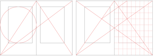
Over time, a lot of systems have been developed for the proportions of a book. Above left, the secret canon of late medieval handwritings as used by Jan Tschichold. The page proportion is 2 : 3 and the proportions of the margins are 2 : 3 : 4 : 6. The height of the text area is equal to the width of the page. The text covers 44% of the surface of a page. Above right, a system of wider size, proportioned 1 : √2 (DIN size). According to Villards Canon, the width and height are divided in nine parts. The proportions of the margins are 4 : 6 : 8 : 11. The text area is again 44% of the pages surface.
Column layout, set width and line interval
The length of a line relative to the point size and line interval plays an important role in making a text legible. When lines are too long, the reader will have difficulty finding the start of the next line. Lines that are too short make for a restless read because the reader needs to jump to the next line too often. Word breaks will moreover be inevitable when a text is set to a narrow measure, as will big white spaces between words when a narrow block of text is justified. The latter phenomenon often occurs in newspapers. For lines that are too wide, legibility is enhanced by enlarging the line interval. A suitable guideline is a line length of ten to twelve words or of sixty to seventy characters. But here too, the designer will have to experiment to arrive at the ideal relations between typeface, point size, line interval and set width.
Back to top
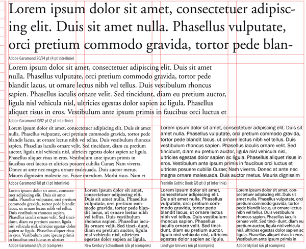
Lorem Ipsum is a dummy text that has been in use for hundreds of years to make proofs before the actual text is available. On the web, these texts can be generated in any desired amount. The texts above are set in a classic way in points on a grid in the Swiss typography style.
Spacing
The use of white space between characters and words depends on the designers personal view and on the influence of the prevailing style of the period. A lot of white between characters and words has sometimes been all the rage, while the following year characters were squeezed nearly against each other. However, we must not overlook the fact that the types designer has looked at letter combinations and indicated their ideal spacing in a so-called kerning table.
Back to top

Spacing a heading by feel is a matter of assessing the white space with ones eyes slightly narrowed and then inserting or deleting some white. Since this is a partly subjective matter, no two designers will reach the same result. The lower line is visually corrected. The arrows indicate where the spacing needed to be reduced.
Paragraphs
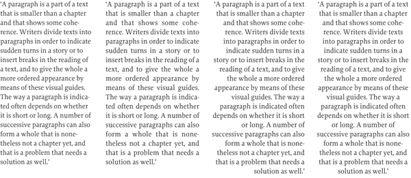
A paragraph is a part of a text that is smaller than a chapter and that shows some coherence. Writers divide texts into paragraphs in order to indicate sudden turns in a story or to insert breaks in the reading of a text, and to give the whole a more ordered appearance by means of these visual guides. The way a paragraph is indicated often depends on whether it is short or long. A number of successive paragraphs can also form a whole that is nonetheless not a chapter yet, and that is a problem that needs a solution as well. All in all, designers have to study the structure, pace and dynamics of a text thoroughly to find the best possible graphic translation for the writers intentions.
Back to top
Different ways of setting type
Lines of type may be set in various ways. The western eye, used to reading from left to right, is most conditioned to text set ranged left. Left-ranged texts can be justified on the right i.e. right-ranging or not. Justified lines of type are seen in newspapers and magazines, where the blocks of text, sometimes separated by a vertical line, result in an orderly and steady image in combination with the headlines, other pieces of text, illustrations and adverts. Because the page is completely filled, the text image has an even grey appearance. Justified lines of type are also used in books like novels, where linear reading is needed with an undisturbed visual impression.
Back to top
Line interval
A 9 pt character has, without extra line spacing, a normal line interval of 9 points. It is specified as point size 9/9 and is said to be set solid. In general, such solid setting is legible because ascenders and descenders should not touch. But for better legible text it is with almost every typeface better to use some line spacing. This mainly depends on the x-height, the length of the ascenders and descenders of the typeface and the length of the lines. The actual image of the characters may be larger in one typeface than another when they are set with the same body size, so that the larger will require more white space. Other things being equal, however, a larger type needs relatively less white space between the lines. Furthermore, a bolder typeface usually requires a somewhat larger line interval. Wide typefaces will ask for somewhat more white to guide the reader to the start of the next line.
Back to top
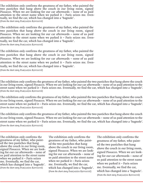
The same text, set to three different measures, each with three different line spacings: set solid in a type size 8.5/8.5, with an extra 1 pt line space in type size 8.5/9.5 and an extra 2 pt line space in type size 8.5/10.5. The typeface used is Quadraat by Fred Smeijers. The general rule is: The longer the lines, the larger the line interval needed. Visually, the type in the left-hand box seems bigger than the other examples. It is not. This should also be taken into account.
Although many designers prefer to work with a limited number of favourite typefaces, it is also important to constantly assess whether a particular typeface is suited to the project in question. Does it include the required styles and symbols? How efficient is the letter? Does it support other languages? Are ligatures or small capitals required? Are old style figures available for use in text containing lots of numbers? Are lining figures available for setting tables and lists? These are the technical conditions that a typeface must meet. If the project is limited and will not be repeated, a typeface without too many trimmings can be chosen one with a limited number of styles and without old style figures and small capitals, for example. This requires a good relationship with the text writer as the choice of typeface can potentially limit their freedom of expression in particular words or terms.
Back to top
Children and the visually impaired
In general, it is true to say that some typefaces are less suited for particular uses while others are specially designed for them. Gill Sans, for example, is very popular for childrens books because it is a humanistic lineal. Distinct shapes with sufficient differences between the individual letters that, especially in the larger font sizes used in books for small children, are more similar to teaching material than seriffed types.
Back to top
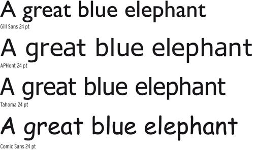
A few typefaces used for childrens books and texts for the visually impaired and dyslexic. Gill Sans is often used for childrens books because of its mild character. APHont was specifically designed for the visually impaired. Tahoma and Comic Sans are considered easily accessible alternatives by interest groups for the visually impaired.
Newspapers
Since the introduction of Times New Roman and Excelsior in the 1930s there have of course been numerous developments with typefaces designed specifically for use in newspapers. The emphasis with these typefaces lies, not surprisingly, in legibility on paper of lesser quality as well as in efficiency. Dutch type designer Gerard Unger is particularly interested in this area. The typefaces Swift, Gulliver and Coranto are three of his designs with large x-heights and large counters. Swift can be seen in many newspapers, both in The Netherlands and further afield. Gulliver is the most extreme newspaper type for saving space. The American paper USA Today was able to reduce the size of its newspaper by 3 cm simply by using this typeface. The Gulliver appears even larger than the previously used Bedford. The Frenchman Jean François Porchez also designed custom typefaces for large clients. The typeface Le Monde was, as its name suggests, designed for the quality French paper Le Monde.
Back to top
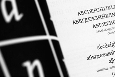
An image taken from the folder for Greta by Typotheque. Greta is one of the most extended typefaces for newspapers with three grades (as with the Miller), narrow and display versions and ornaments. Photo: Joep Pohlen.
Signposting
Signposting requires a different set of initial criteria than newspapers. It is noteworthy that many typefaces designed specifically for signposting have also become the most popular sans-serifs for newspapers. This is the case with the American roadways typeface Interstate, which recently has been replaced by the typeface Clearview, and with Frutiger.
Back to top
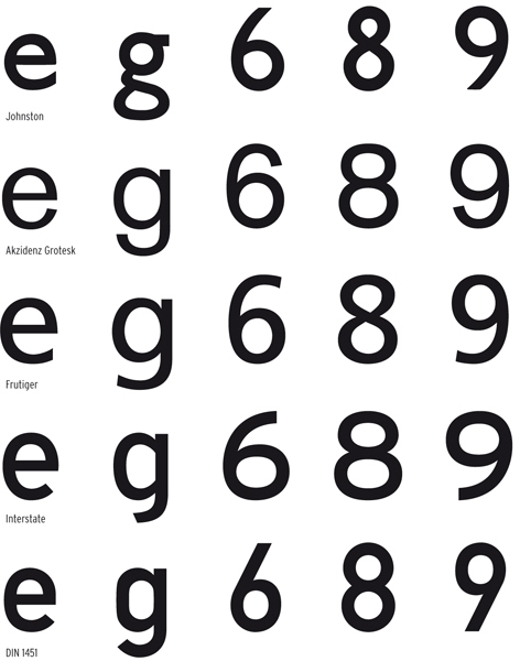
Above, the differences in typefaces for signposting. At the top is the Johnston sans-serif drawn for the London Underground in 1916. Akzidenz Grotesk from 1896 was used for the signposting at Schiphol Airport and was later replaced by Frutiger. Interstate is used for road signposting in many countries including the USA, Spain, The Netherlands, Australia, New Zealand and several Central American and South American countries. The DIN 1451 is used in Germany, Czech Republic and elsewhere.
Corporate fonts
The so-called corporate fonts are another important area for type designers. These fonts are often greatly extended and focus on expressing the image of a company or institution and making the typeface fit in with its specific demands. One of the first was the VAG by Adrian Williams from 1979 for Volkswagen AG.
Back to top
Dictionaries and bibles
Very specific typefaces have been developed for space-saving typography such as is required in dictionaries, bibles and encyclopaedias, as well as the Yellow Pages and other telephone books. A version of Lexicon including phonetic symbols was made for Van Dale Lexicografie, publisher of the most renowned Dutch dictionary. Bram de Does designed Lexicon with special styles including shortened descenders and ascenders.
Back to top
Mixed typeface families
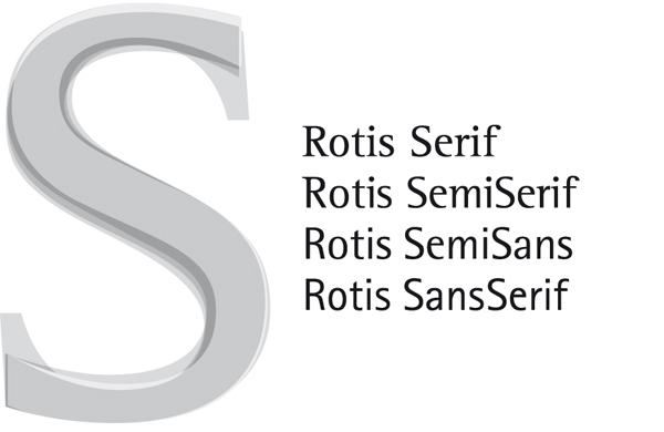
Mixing typefaces is becoming more and more common due to the use of both seriffed and sans-serif typefaces within corporate identities, with one publication requiring perhaps a less businesslike feel than another. As such, extended typeface families have been created, particularly for corporate typefaces, which include both sans-serifs and types from other categories in the classification.
Back to top
Body text typefaces
A great many of the available and most widely used typefaces were designed primarily for use as body text. It remains true that a typeface for body text should be technically correct. It should be designed so as to avoid output problems, should be well spaced and the characters available should be useable and numerous. Most typefaces still in use today are revivals of designs hundreds of years old, even from the very beginning of type design. One much used source is the work of Claude Garamond.
Back to top
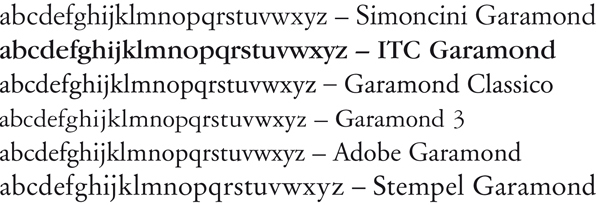
A selection of six Garamonds, each with its own character, yet all stemming from the same origins. Outside this selection there are countless versions with the same name and still more with other names, all stemming from the Garamond in form and feel.
======================================================================================
Leaf through Letter Fountain
Back to top
The influences of punk and graffiti
In the 1970s, the years of punk, young people began to develop their own code of communication. In the exciting, mildly illegal world of messages sprayed on walls, a strongly coded picture-writing came into existence, which was almost a secret language and in which the shapes, the graffiti, were a source of inspiration for both an artistic movement with Keith Haring as figurehead and a new idiom in the world of graphic design. Graphic designers looked with Argus eyes at the freedom of colour, letter and image and began sketchy experiments with the elasticity of the letter as a shape and as a representation of its meaning.
Back to top

Typography on an album of the punk group The Tubes. It clearly shows that the letters have been deliberately distorted. These typefaces are generally traditional in character. Photo: Joep Pohlen.
The magazine as catalyst
In a number of magazines aimed at a younger audience and in designs for new record companies and for progressive television stations there emerged a new class of designers with an experimental approach to ideas and techniques and who were exploring the monumental, autonomous possibilities of expression with type. From the early 1980s, graphic designer Neville Brody found his influences in punk and Dadaism for his work for the English magazine The Face. He shared the opinions of designer Wolfgang Weingart from Basel, whose reaction against the hegemony of the Swiss international style is referred to as new wave typography, and who stated that legibility is not the same as easy to read.
Back to top

New forms, old sources. Above, a cover of the magazine Club DaDa from 1918. DaDa was one of the sources of inspiration for designers like Neville Brody and Art Chantry.
The type industry ploughed forth
Aside from the wild young designers who attempted to force a breakthrough with their designs, the type industry was still shaped by a heavy ballast of hundreds of years of tradition and bulky typesetting machines. When phototypesetting machines slowly began replacing the mechanical typesetting machines during the 1970s, designers Herb Lubalin and Aaron Burns set up the International Typeface Corporation (ITC). Their innovation was that ITC designed and introduced typefaces that did not take into account the restrictions of typesetting machines. The design itself was the starting point.
Back to top

Avant Garde Gothic was one of the first typefaces released by ITC. It is named after the magazine Avant Garde, where Herb Lubalin was art director. Avant Garde was designed with extreme spacing and unique ligatures (see above). These were later omitted from the PostScript version but were re-introduced in the OpenType version released by ITC in 2005.
The first digital type company
Type designer Matthew Carter and divisional manager of Linotype Mike Parker decided to begin their own company in 1980, with the focus purely on design and distribution. They called it Bitstream. They were supported by young producers of hardware such as Scitex that had developed powerful digital machinery but who did not have time to design their own typefaces. Bitstream filled the gap in the market and set to work with its own collection.
Back to top
Ordinary letter production
It seems as if this period was dominated by technique and to a certain degree this was the case. The new photographic and digital techniques required a great deal of adaptation, but at the same time there was also a great deal of aesthetic innovation in the primary typographic process. In 1975, AT&T commissioned Matthew Carter to design Bell Centennial. The letters contain so-called ink traps, which compensate for the effects of ink flow on thin, absorbent paper during the process of printing telephone books.
Back to top

Bell Centennial by Matthew Carter with its characteristic ink traps.
Emigre
Dutch designer Rudy VanderLans graduated in 1980 and then began working at the studios Vorm Vijf and Tel Design in The Hague, but was disappointed that his work was not more creatively challenging. The work of many larger bureaus consists partly of creating corporate identities, where the production process itself actually takes up more time than the creative process. He decided to spend some time travelling through America and enrolled as a student at the University of California at Berkeley, where to his surprise he was immediately accepted. There he met Zuzana Licko, whom he married in 1983. With a few other Dutch designers who had also travelled to the West Coast, VanderLans created the magazine Emigre. The first issue was designed completely with typewriter typography and photocopied photos. Licko was very interested in computers and quickly began to experiment and to programme. In 1984 VanderLans and Licko purchased one of the first Macs, with 128K of memory. Licko subsequently began to design low-resolution typefaces with the FontEditor programme that was available as public domain software. The first typefaces they designed were Emperor, Emigre and Oakland, made for use on the dot matrix printer. In Emigre 2, published in 1985, Emigre and Oakland were used for the first time in sections of the text. Unique to Emigre is that Zuzana Lickos development as a type designer stemmed from the techniques available and was particularly linked to the arrival of the computer as replacement of traditional typesetting machinery. Although she received a lot of criticism about the legibility of her texts, this lessened over time.
Back to top

Oakland and Emperor by Zuzana Licko. The numbers Eight, Fifteen and Nineteen refer to the pixel height of the capitals. Below is the lowercase g of Oakland Eight. The number of pixels can easily be counted.
FontShop
In his first book, The Graphic Language of Neville Brody, released in 1988, Neville Brody states that he had nothing to do with what he considered the too-easy computer, but he subsequently set up the type foundry FontShop in 1990 together with Erik and Joan Spiekermann. Many type foundries were founded around 1990 but FontShop, like Emigre, spent the following years building a consequently sound collection, which now includes several thousand typefaces. Between 1991 and 2000, Neville Brody and Jon Wozencroft together published the Fuse series under the flag of FontShop. Four designers per publication were asked to submit an experimental typeface that had been designed especially for Fuse. The publication was presented in a cardboard box and included a floppy computer disk with the typefaces in PostScript format and four posters, one by each designer. A number of the typefaces were later completed and included in FontShops FontFont collection. Dozens of famous type and graphic designers took part in this exercise.
Back to top

Fuse 1 from the summer of 1991. The box contains four folded posters, one for each of the four typefaces included. From left to right: F State by Neville Brody, F Stealth by Malcolm Garrett, F Can You ...? by Phil Baines and F Maze by Ian Swift. Photo: Joep Pohlen.
Linotype
This type company, which is home to a great tradition in the world of type design, almost missed the boat in the early days of digital type. After Bitstream had tried in vain to acquire licences, Adobes request in the mid-eighties was granted and URW in Hamburg began digitising famous Linotype typefaces such as Helvetica, Univers, Optima and the Frutiger. This was followed in 1990 by the fusion with the firm Dr. Ing. Rudolf Hell GmbH, a pioneer in the area of digital typesetting. The type collection at Hell consisted almost exclusively of relatively new designs by Dutch designer Gerard Unger and German designer Hermann Zapf. This collaboration once again saw the light of day in 1997 in Heidelberg Druckmaschinen AG. Heidelberg named the type library Linotype Library and in 2005 this was shortened to Linotype, which is now a component of Monotype Imaging.
Back to top

Two calligraphic typefaces from the Linotype collection. Wilhelm Klingspor Gotisch was designed in 1925 by Rudolf Koch. Zapfino by Hermann Zapf dates from 1998 and is a true digital typeface that was never made for metal typesetting. In fact it could not have been, due to the fine overlapping lines and the intersecting ascenders and descenders.
In 1996 Linotype also launched a significant project under the direction of Olaf Leu to develop a typeface specifically for annual reports. Olaf Leu and his team came to the conclusion that it should initially be a typeface with four styles and four versions. After a thorough comparison of existing typefaces, a list of advantages and disadvantages was formulated and the Compatil was made in four versions: Compatil Exquisit (a humanistic), Compatil Fact (a sans-serif), Compatil Letter (a slab-serif) and Compatil Text (more transitional than didone). In total it comprises sixteen styles with small capitals and Central European character sets. A unique feature is that the four different typefaces can be interchanged because the overall text width is the same in each version.
Back to top

The examples above clearly show how systematically the Compatil is constructed and how the width of all four styles is consistently equal without the whole appearing forced or out of balance.
Berthold
The story of Berthold is very different. Even though designer Günter Gerhard Lange returned in 2000 in his senior years as artistic director, the company never regained its leading role in the industry. At Berthold, Lange designed typefaces such as Concorde, AG Book, Arena and Imago and above all he designed various revivals of typefaces like Baskerville, Bodoni, Akzidenz Grotesk and Garamond. Also noteworthy in the Berthold system is that the cap height is given in millimetres and serves as a measurable font size.
Back to top

Above, the lowercase a from Formata. Right, some designs from Berthold and below them a series of typefaces from Berthold with a font capital size of 18 mm. Below that, a series of typefaces from other foundries that each has a different capital height at a font body size of 54 pt.
Monotype
Monotype is one of the most prominent suppliers of typesetting machinery and typefaces. Just like Linotype and Berthold, Monotype landed in a crisis when the arrival of the Mac made its hardware obsolete. A wave of new owners came and went. In 1998, Agfa (with the former Compugraphic library) took over Monotype and combined their typefaces under the collective name Agfa Monotype. In 2000, the International Typeface Corporation collection (ITC) was added, which had previously taken over the Letraset library, and under direction of a new owner the company name was changed to Monotype Imaging. Monotype has since also taken over Linotype.
Back to top

ITC Legacy is a design by Ronald Arnholm from 1992 with a Serif and a Sans. The Serif Bold is shown here.
Adobe Type Library
This collection was started in 1984 to help boost Adobes sales of software products and desktop publishing as a whole. It is a credit to Adobe that the quality of its typefaces for use in its own software was taken seriously right from the start. The Adobe Type Library is a purely digital collection and brings with it no excess baggage from the traditions of the industry. In order to make a quick start, licences were purchased for the bestsellers from other suppliers. Adobe has also always respected artists rights and requested licences right from the beginning.
Back to top

Above, Myriad from 1992, Nueva from 1994 and Chaparral from 1997 by designer Carol Twombly. All are OpenType versions.
Industrious type designers
If you can do it yourself, then why not do just that? More and more type designers came to the realisation that they could promote and sell their own work on the internet. The whole process ultimately begins with the designer. The smaller font suppliers should certainly be and now often are taken seriously and some offer typefaces that equal those of the most famous firms in quality. Jean François Porchez began his own type publishing company after having his FF Angie published by FontShop. Lucas de Groot released the successful FF Thesis through his own company LucasFonts and David Quay began The Foundry after having designed various typefaces for Letraset and Quay Sans for ITC. The American company Font Bureau was also started in this way in 1989 by founders David Berlow and Roger Black. They designed mainly custom (body text) typefaces for publications like the New York Times and Newsweek. Tobias-Frere Jones designed the popular Interstate for Font Bureau and later began his own company with Jonathan Hoefler. In 1991, Matthew Carter left Bitstream, which he had co-founded, and started a new company Carter & Cone together with Cherie Cone.
In Germany there are a few bureaus that are not predominantly active in designing but that provide services between the producer and the user. Elsner + Flake is the design studio of Veronika Elsner and Günther Flake from Hamburg, founded in 1986. They have digitised typefaces for authoritative producers such as ITC, and expanded them with euro symbols and Central European symbols. Turkish, Greek, Arabic and Hebrew typefaces are also available in the ever-growing Elsner + Flake library. Over time they have made their own designs and added revivals and display fonts to their collection. The second Hamburg-based studio to be involved in the digitisation of typefaces from the beginning of the digital era is URW++. Directed by Peter Karow, URW (without plusses in the beginning) developed the programme Ikarus, which was used in the early days of the digital era by large foundries such as Linotype, Monotype and Berthold for the digitisation of typefaces.
In The Netherlands there are still a few type companies that work in a typographic tradition to supply typefaces mainly for use in books. The first is The Enschedé Font Foundry (TEFF). The printing company Joh. Enschedé en Zonen was founded in 1703 and is renowned for its high-quality printing of bank notes, postage stamps and other unique works. The company purchased the type foundry of Hendrik Floris Wetstein in 1743 and began producing its own typefaces. Famous names have since worked for or at Enschedé, including Joan Michael Fleischmann, Jan van Krimpen and Bram de Does. In 1978 Enschedé commissioned De Does to design a new typeface for the phototypesetting system at Enschedé to commemorate its 275th anniversary. This typeface became Trinité. The demand for Trinité was what led Peter Mathias Noordzij to begin TEFF in 1991, thereby continuing Enschedés tradition of craftsmanship into the digital era. In 1992 Lexicon was introduced, originally designed specifically for the dictionary publisher Van Dale. Fred Smeijers designed the Renard, Gerrit Noordzij the Ruse and Christoph Noordzij the Collis. It is a small company with beautiful, classical typefaces for the discerning user.
Back to top

Above The Enschedé Font Foundrys 1997 specimen, designed by Marie-Cécile Noordzij, of Bram de Doess Lexicon. The right-hand page clearly shows the different ascender and descender lengths of the various Lexicon styles. The aim of this was to minimise the line spacing, therefore making the face of the letter as large as possible in the typographic and aesthetic balance between legibility and the bulk of a dictionary. Photo: Joep Pohlen.
A second producer is Dutch Type Library (DTL) that, like TEFF, specialises in typefaces for books. Founded in 1990 by Frank Blokland, it aims at supplying high-quality typefaces of Dutch and Flemish origin. Their production levels are higher than at TEFF with half the typefaces new designs and the rest re-releases and revivals. Type designers are asked by Blokland to create a design, and then the subsequent technical processes are carried out by DTL. Re-releases are Albertina from 1960 by Chris Brand and Haarlemmer, designed in 1938 by Jan van Krimpen but never previously put on the market. Both were originally made for Monotype.
Back to top

Above, Haarlemmer from a 1998 DTL type specimen. Photo: Joep Pohlen.
Autonomous type design
As well as the two extremes of the spectrum, the legible and the illegible typography and all the in-between forms with their corresponding typefaces, there are also designers who take experimentation as their starting point. They explore the boundaries of typography and type design. The Frenchman Pierre di Sciullo is one such designer. He received the Charles Nypels Prize in 1995 for his typographic experiments. He has produced the magazine Qui? Résiste (www.quiresiste.com) since 1983, in which he experiments with quotes, collages and transformations.
Back to top

Left, Sintetik by Pierre di Sciullo, with the word photography clearly visible, spelled phonetically. On the right, his FF Minimum, which was released by FontShop. Below the Clair, Medium and Noir styles in the first column are the Horizontal and Vertical styles that comprise only the horizontal and vertical lines of the text.
The Dutch designer Max Kisman, many of whose designs can be found in the Fuse series, was experimenting with computers to make new designs even before the introduction of the Mac. In 1986 he and some friends began the magazine TYP/Typografisch papier, which has since then been sporadically produced. The Dutchmen Erik van Blokland and Just van Rossum joined forces to create the studio LettError, winning the Charles Nypels Prize in 2000 for their typographic innovations. They treated the letter as an actor who received instructions via the computer about how he should appear. Each letter can act differently, as in the typeface Beowolf from 1990 where the contour is defined at random, within certain limits. FF Beowolf was also one of the first typefaces of the then-young FontShop.
Back to top

Above, Network by Max Kisman, a typeface similar in form to the letters he drew in the Tegentonen posters for Paradiso in Amsterdam. Beneath this is Kosmik by LettError. Both the Plain and the Bold have three styles with alternative characters so that the illusion can be created that the text has been handwritten. The Kosmik Glyphs are symbols. At the bottom, Trixie by Erik van Blokland.
In 1992 in Spain, Type-Ø-Tones was founded by four designers: Joan Barjau, Enric Jardí, Laura Meseguer and José Manuel Urós. Production halted in 1999 and their typefaces became available for purchase through FontShop. The collection consists solely of display typefaces. Laura Meseguer, who had previously designed several typefaces for Type-Ø-Tones, decided to follow the Type and Media course at the KABK in The Hague, where she then designed Rumba, a typeface comprising the three styles Small, Large and Extra. Rumba was awarded a TDC Certificate of Excellence in 2005.
Back to top

Three different forms of Rumba by Laura Meseguer. Below, the complete character set of the Rumba Small. With thanks to Laura Meseguer for the PDF of the typeface.
Two other Spanish designers, Andreu Balius and Joan Carles Perez Casasín, founded the Typerware bureau in 1993. The project in which they made their experimental type designs public, through a website and through printed publications, was called garcia fonts & co. These typefaces were not for sale; they could only be swapped for typefaces by guest designers who would then be included in the garcia fonts & co. project. Type designs by FF FontSoup, ITC Belter and ITC Temble are for sale at Typerware. Balius now has his own type foundry called Type Republic, offering several renowned typefaces such as the classical Pradell (2000 2003), inspired by designs of the Catalan punchcutter Eudald Pradell (1721 1788).
Back to top

Pradell (above) and Trochut (below) are designs by Andreu Balius, who was inspired by old Catalan typefaces.
The Englishman Jonathan Barnbrook from the Virus type company began designing typefaces because he believed that designers had significant influence on elements such as image and layout in a design, but not on the typeface. When he got hold of the FontStudio programme in 1989, he finally had the feeling that he had complete control. At Emigre, Barnbrook published the typefaces Exocet and Mason. There are a great many examples of designers that began in the rough years of digital type design, when there was a certain amount of competition to design the most extreme type, and who then returned to the more classical traditions of the industry.
Back to top
Bukva:Raz!
Organizations founded specifically to serve typography and type design, such as the Association Typographique Internationale (ATypI) and the Type Directors Club (TDC), like to keep a finger on the pulse of developments within the industry. But type companies such as Linotype are also interested in market developments. This is why competitions are held. The TDC does this every year and publishes a book containing the winners. In 2000 the ATypI organized a competition for the first time since its establishment in 1957 and called it Bukva:Raz! From the six hundred submissions, they chose one hundred type designs, including not only Latin typefaces but also Arabic, Hebrew, Cyrillic and Greek designs. They are all illustrated in the book Language Culture Type, published by Graphis and ATypI. The hundred typefaces from the Bukva:Raz! selection show how much has changed over the last two decades and that the worldwide select group of designers has expanded to include a selection of hundreds of designers who are fascinated with both past and present. But most noteworthy is that many of the designs recognised by Bukva:Raz! also come from countries like Russia, Portugal, Mexico, Armenia and Argentina and even more surprising is that many of these are designs that cannot be categorised according to their geographical origins.
Back to top

Latina, by the Spanish designer Iñigo Jerez Quintana, with a Sans and a Serif. The designer himself says this greatly extended type family may never be finished. The Latina is not yet available but did appear in the book Language Culture Type. Photo: Joep Pohlen.
Typographic recommendations
Typography has a threefold purpose: first, to rouse peoples interest to read a text; second, to enhance legibility; and finally, typography determines the direction and speed of reading. These general typographic purposes are furthermore influenced by two other factors: the clients intentions and the graphic designers or typographers personality. The intentions of a client are expressed in the feel of a text: Is it long or short, informative or attractive, narrative or demonstrative? The choice of medium is also important: Is it a reading or study book, a magazine or a company brochure, a poster or a business card? Whereas, in order to limit the size, a book will require a type that is more economical, this may be less imperative in case of a brochure. A designers or typographers personality, on the other hand, can express itself in either a certain sobriety or a more elaborate use of form and colour.
The general purpose, mainly aimed at serving the reader, is obviously governed by certain rules. It needs to be explicitly stated, however, that every conceivable rule only becomes truly interesting by the grace of its possible exceptions. Or, as a famous designer answered when asked why he had suddenly turned his back on his own strict pattern typography after forty years: I invented the system, so I can fuck the system.
Still, some recommendations for making texts optimally legible have arisen by experience. These recommendations are partly based on the tradition of setting metal type but have also resulted from computer typesetting and editing. Trying out different versions and changing details is done much more quickly on a computer. In this respect, todays typographers are in much closer contact with the end product than during the long period of metal type and the ensuing typographic interbellum, when hot metal typesetting and phototypesetting were used together, and digital typesetting started its advance in printing offices.
Back to top

Dadaism or dada began in Zürich, Switzerland, but was soon adopted by artists in various other countries. Dadaism played with form and content. This illustration, designed by El Lissitzky, is an example of the style.
The first step
As indicated before, typography has a threefold purpose that, from a users point of view, can be divided into three steps. The first step is the first impression a page makes. This impression often determines whether or not a reader is interested enough to begin reading. Whether the text may be read or must be read is, of course, an important difference. The first example could be a newsletter or magazine where the choice to read or not lies with the reader. The second text could be the theory needed for a driving test or perhaps an instruction manual on how to fill out your tax returns. In the first example, an attractive layout is obviously more logical because the reader needs to be persuaded. In the second example, the informative character is more important because the reader needs to be able to clearly and easily take in the information.
Back to top
The second step
Enhancing legibility is the second step, which goes deeper than a texts first impression. This stage goes one step beyond asking for attention by means of catchy headlines or a provocative picture. In the case of quality newspapers, by the way, steps one and two can be rolled into one. This second step, however, expressly deals not only with first impressions and encouragement, but also with typographic attention on both word and letter level. This is what we call microtypography, which is all about the detailing of headings, grades, spacing, line interval, line length, ensuring register, indents, tabs, white lines, the alignment of the text, word breaks, the use of punctuation marks, the use of numerals and ligatures, the placement of initials, the proportion of captions and footnotes to the body text, the placement of illustrations in a text, the layout of tables, etc.
Back to top

The text typography here is largely concerned with legibility and microtypography.
The third step
Equally important are the direction and speed of reading. A number of ways of reading can be distinguished, each demanding a different solution.
- Linear reading is applicable to a text that can be read from beginning to end without too many obstacles. An example of such a text is a novel. You could call it invisible typography for the voluntary reader.
- Nuanced reading is applicable to a publication that contains continuously structured information, but still allows the reader to start at any random point. Examples are scientific and educational works. The layout usually contains one wide column of text and a narrow column for additional referencing, although a layout of two or more columns is also possible.
- Selective reading is applicable to a publication that contains several interconnecting layers that can also be read separately. An example is a schoolbook, since a school child may be less motivated than a college or university student. The layout sometimes consists of one column, but two columns are normal too, plus a lot of space for illustrations. The page contains a lot of white space to allow the eye some rest and in order to isolate the text from its surroundings.
- Scanning style of reading is applicable to texts that are aimed at answering questions. Examples are an encyclopaedia, a bibliography, a dictionary and large parts of the internet. Think, for instance, of quick and effective Googling to find information. The layout usually consists of two or three columns in a dictionary or encyclopaedia.
- Comprehensive reading is applicable to a text for which an understanding of each sentence is important. Examples are childrens books and an anthology of poetry. Speed is of lesser importance. One column often suffices.
- Informative reading is applicable when reading a newspaper. We pick and choose what we find important and let our eye wander the page to find what interests us. We seldom read a paper from A to Z. A newspaper has many columns. The supplements usually have fewer columns to enable a story-like structure.

This spread from the Larousse Universel of 1923 shows an example of a layout that is aimed at a scanning way of reading. The eye is caught by the words in bold in the three columns and of course by the wonderful drawings that have been placed in the text. Photo: Joep Pohlen.
Paper and page size
Because of a thorough standardisation, normalised DIN A sizes are usually the starting point for paper sizes for printed matter. The sizes of the sheets of paper that are supplied by paper manufacturers are based on these DIN A sizes, with a bit added for trimming, the gripper margin of the printing press and the finish. DIN sizes use a 1 : √2 ratio. Besides the well-known A sizes, B and C sizes are also used. The B sizes are so-called uncut sizes so the page can be printed with bleed, after which the sheet can be cut to A size.
Back to top

The grid as base
A useful grid simplifies the systematic and logical rendering of text and images, adds rhythm to the text and image structure and ensures that the visual information is conveyed in a structured and transparent way. A good grid, moreover, offers economic advantages as well. Because design solutions have been set, an assignment can be completed in less time and with less cost.
Back to top

Over time, a lot of systems have been developed for the proportions of a book. Above left, the secret canon of late medieval handwritings as used by Jan Tschichold. The page proportion is 2 : 3 and the proportions of the margins are 2 : 3 : 4 : 6. The height of the text area is equal to the width of the page. The text covers 44% of the surface of a page. Above right, a system of wider size, proportioned 1 : √2 (DIN size). According to Villards Canon, the width and height are divided in nine parts. The proportions of the margins are 4 : 6 : 8 : 11. The text area is again 44% of the pages surface.
Column layout, set width and line interval
The length of a line relative to the point size and line interval plays an important role in making a text legible. When lines are too long, the reader will have difficulty finding the start of the next line. Lines that are too short make for a restless read because the reader needs to jump to the next line too often. Word breaks will moreover be inevitable when a text is set to a narrow measure, as will big white spaces between words when a narrow block of text is justified. The latter phenomenon often occurs in newspapers. For lines that are too wide, legibility is enhanced by enlarging the line interval. A suitable guideline is a line length of ten to twelve words or of sixty to seventy characters. But here too, the designer will have to experiment to arrive at the ideal relations between typeface, point size, line interval and set width.
Back to top

Lorem Ipsum is a dummy text that has been in use for hundreds of years to make proofs before the actual text is available. On the web, these texts can be generated in any desired amount. The texts above are set in a classic way in points on a grid in the Swiss typography style.
Spacing
The use of white space between characters and words depends on the designers personal view and on the influence of the prevailing style of the period. A lot of white between characters and words has sometimes been all the rage, while the following year characters were squeezed nearly against each other. However, we must not overlook the fact that the types designer has looked at letter combinations and indicated their ideal spacing in a so-called kerning table.
Back to top

Spacing a heading by feel is a matter of assessing the white space with ones eyes slightly narrowed and then inserting or deleting some white. Since this is a partly subjective matter, no two designers will reach the same result. The lower line is visually corrected. The arrows indicate where the spacing needed to be reduced.
Paragraphs
A paragraph is a part of a text that is smaller than a chapter and that shows some coherence. Writers divide texts into paragraphs in order to indicate sudden turns in a story or to insert breaks in the reading of a text, and to give the whole a more ordered appearance by means of these visual guides. The way a paragraph is indicated often depends on whether it is short or long. A number of successive paragraphs can also form a whole that is nonetheless not a chapter yet, and that is a problem that needs a solution as well. All in all, designers have to study the structure, pace and dynamics of a text thoroughly to find the best possible graphic translation for the writers intentions.
Back to top
Different ways of setting type
Lines of type may be set in various ways. The western eye, used to reading from left to right, is most conditioned to text set ranged left. Left-ranged texts can be justified on the right i.e. right-ranging or not. Justified lines of type are seen in newspapers and magazines, where the blocks of text, sometimes separated by a vertical line, result in an orderly and steady image in combination with the headlines, other pieces of text, illustrations and adverts. Because the page is completely filled, the text image has an even grey appearance. Justified lines of type are also used in books like novels, where linear reading is needed with an undisturbed visual impression.
Back to top

Line interval
A 9 pt character has, without extra line spacing, a normal line interval of 9 points. It is specified as point size 9/9 and is said to be set solid. In general, such solid setting is legible because ascenders and descenders should not touch. But for better legible text it is with almost every typeface better to use some line spacing. This mainly depends on the x-height, the length of the ascenders and descenders of the typeface and the length of the lines. The actual image of the characters may be larger in one typeface than another when they are set with the same body size, so that the larger will require more white space. Other things being equal, however, a larger type needs relatively less white space between the lines. Furthermore, a bolder typeface usually requires a somewhat larger line interval. Wide typefaces will ask for somewhat more white to guide the reader to the start of the next line.
Back to top

The same text, set to three different measures, each with three different line spacings: set solid in a type size 8.5/8.5, with an extra 1 pt line space in type size 8.5/9.5 and an extra 2 pt line space in type size 8.5/10.5. The typeface used is Quadraat by Fred Smeijers. The general rule is: The longer the lines, the larger the line interval needed. Visually, the type in the left-hand box seems bigger than the other examples. It is not. This should also be taken into account.
Choosing a typeface
Although many designers prefer to work with a limited number of favourite typefaces, it is also important to constantly assess whether a particular typeface is suited to the project in question. Does it include the required styles and symbols? How efficient is the letter? Does it support other languages? Are ligatures or small capitals required? Are old style figures available for use in text containing lots of numbers? Are lining figures available for setting tables and lists? These are the technical conditions that a typeface must meet. If the project is limited and will not be repeated, a typeface without too many trimmings can be chosen one with a limited number of styles and without old style figures and small capitals, for example. This requires a good relationship with the text writer as the choice of typeface can potentially limit their freedom of expression in particular words or terms.
Back to top
Children and the visually impaired
In general, it is true to say that some typefaces are less suited for particular uses while others are specially designed for them. Gill Sans, for example, is very popular for childrens books because it is a humanistic lineal. Distinct shapes with sufficient differences between the individual letters that, especially in the larger font sizes used in books for small children, are more similar to teaching material than seriffed types.
Back to top

A few typefaces used for childrens books and texts for the visually impaired and dyslexic. Gill Sans is often used for childrens books because of its mild character. APHont was specifically designed for the visually impaired. Tahoma and Comic Sans are considered easily accessible alternatives by interest groups for the visually impaired.
Newspapers
Since the introduction of Times New Roman and Excelsior in the 1930s there have of course been numerous developments with typefaces designed specifically for use in newspapers. The emphasis with these typefaces lies, not surprisingly, in legibility on paper of lesser quality as well as in efficiency. Dutch type designer Gerard Unger is particularly interested in this area. The typefaces Swift, Gulliver and Coranto are three of his designs with large x-heights and large counters. Swift can be seen in many newspapers, both in The Netherlands and further afield. Gulliver is the most extreme newspaper type for saving space. The American paper USA Today was able to reduce the size of its newspaper by 3 cm simply by using this typeface. The Gulliver appears even larger than the previously used Bedford. The Frenchman Jean François Porchez also designed custom typefaces for large clients. The typeface Le Monde was, as its name suggests, designed for the quality French paper Le Monde.
Back to top

An image taken from the folder for Greta by Typotheque. Greta is one of the most extended typefaces for newspapers with three grades (as with the Miller), narrow and display versions and ornaments. Photo: Joep Pohlen.
Signposting
Signposting requires a different set of initial criteria than newspapers. It is noteworthy that many typefaces designed specifically for signposting have also become the most popular sans-serifs for newspapers. This is the case with the American roadways typeface Interstate, which recently has been replaced by the typeface Clearview, and with Frutiger.
Back to top

Above, the differences in typefaces for signposting. At the top is the Johnston sans-serif drawn for the London Underground in 1916. Akzidenz Grotesk from 1896 was used for the signposting at Schiphol Airport and was later replaced by Frutiger. Interstate is used for road signposting in many countries including the USA, Spain, The Netherlands, Australia, New Zealand and several Central American and South American countries. The DIN 1451 is used in Germany, Czech Republic and elsewhere.
Corporate fonts
The so-called corporate fonts are another important area for type designers. These fonts are often greatly extended and focus on expressing the image of a company or institution and making the typeface fit in with its specific demands. One of the first was the VAG by Adrian Williams from 1979 for Volkswagen AG.
Back to top
Dictionaries and bibles
Very specific typefaces have been developed for space-saving typography such as is required in dictionaries, bibles and encyclopaedias, as well as the Yellow Pages and other telephone books. A version of Lexicon including phonetic symbols was made for Van Dale Lexicografie, publisher of the most renowned Dutch dictionary. Bram de Does designed Lexicon with special styles including shortened descenders and ascenders.
Back to top
Mixed typeface families
Mixing typefaces is becoming more and more common due to the use of both seriffed and sans-serif typefaces within corporate identities, with one publication requiring perhaps a less businesslike feel than another. As such, extended typeface families have been created, particularly for corporate typefaces, which include both sans-serifs and types from other categories in the classification.
Back to top

Body text typefaces
A great many of the available and most widely used typefaces were designed primarily for use as body text. It remains true that a typeface for body text should be technically correct. It should be designed so as to avoid output problems, should be well spaced and the characters available should be useable and numerous. Most typefaces still in use today are revivals of designs hundreds of years old, even from the very beginning of type design. One much used source is the work of Claude Garamond.
Back to top

A selection of six Garamonds, each with its own character, yet all stemming from the same origins. Outside this selection there are countless versions with the same name and still more with other names, all stemming from the Garamond in form and feel.
======================================================================================
Leaf through Letter Fountain
